
Coca-Cola and Tinder relaunched in the same week. Only one of them rebranded.
The brand refresh versus rebrand question just got answered twice, in public, in opposite directions.
On 20 July, Coca-Cola launched a new global visual identity across more than 200 markets. Almost nothing you would recognise changed. The week before, Tinder unveiled its first new identity in nearly ten years, and almost everything did. Between them, those two projects settle the brand refresh versus rebrand question better than any framework will. A refresh fixes how a brand shows up. A rebrand fixes what it means. Most companies asking for the second one need the first.
The useful part is that both were done well, by good studios, for sound reasons. They are not a right answer and a wrong one. They are two different problems, correctly diagnosed.
Coca-Cola spent the money on the part nobody sees
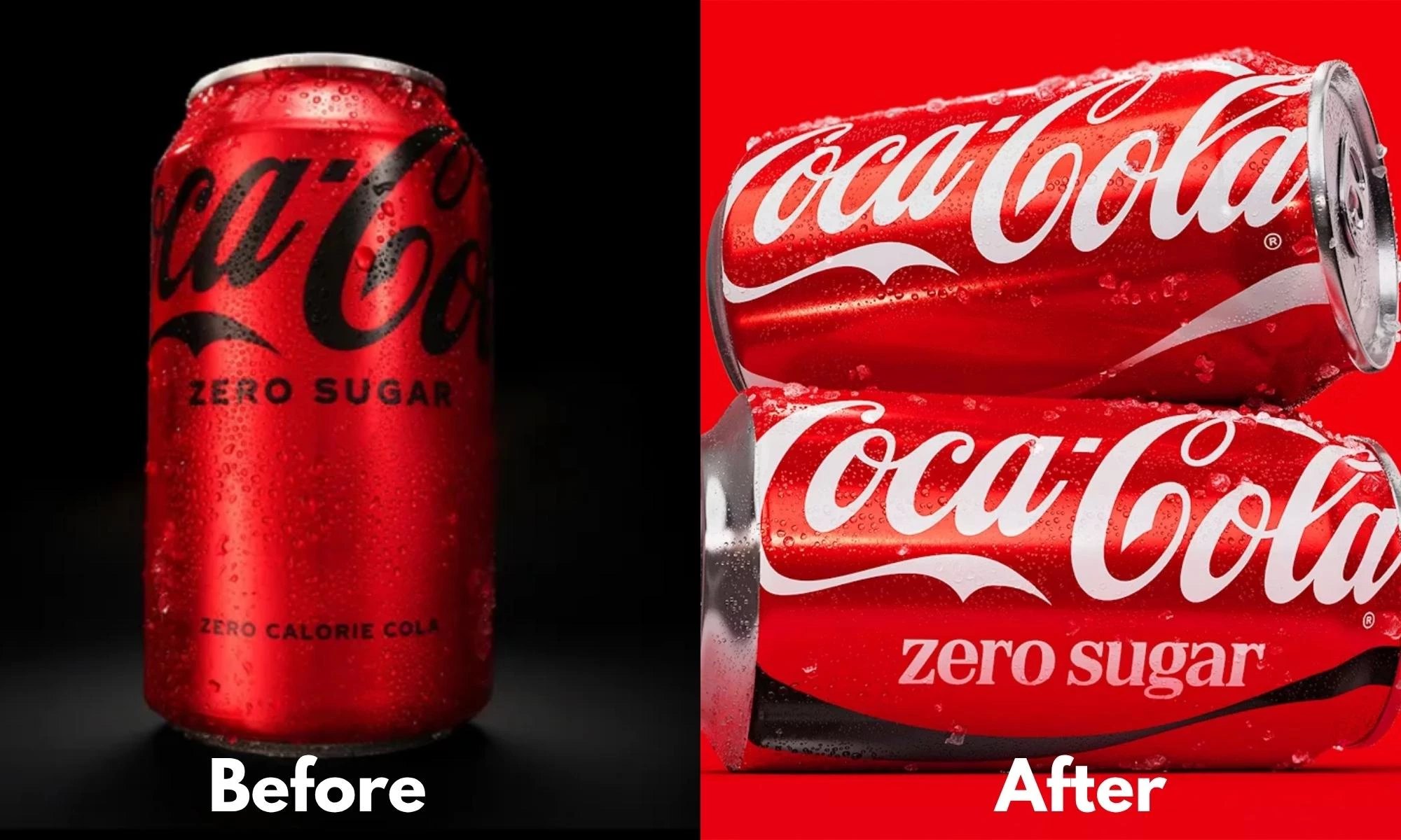
Coca-Cola’s brief was not to reinvent anything. Its own announcement is unusually plain about it: the red and white palette, the Dynamic Ribbon, the Arden Square and the Spencerian script all stay, and the job was to make each of them land harder and more consistently everywhere the brand appears. JKR led the identity, The SUPERULTRARARE built the packaging system and Brody Associates cut the type. The most visible change on a can, per The Dieline’s report on 20 July, is the wordmark going vertical again after close to a decade lying horizontal. On Coke Zero Sugar, the black gives way to the white script on red.
That is not where the money went. Alongside the identity, Coca-Cola launched a Brand Center and a set of AI-assisted Design Intelligence tools, built with Adobe and trained on the company’s own archive, so that thousands of marketers and agency partners across those 200-plus markets keep applying the system the same way long after the launch coverage fades. The rollout order tells you the same thing: Europe, the Middle East and India first, North America not until 2027. This is an operations project wearing a design announcement.
Rapha Abreu, the company’s global vice president of design, described the work as celebrating the legacy while looking to the future. Read past the press language and the diagnosis is sharper than that. The most recognised brand on earth concluded that its problem was not what it looked like. It was how reliably it looked like itself. Sit with that for a second, because whatever drift exists between your website, your packaging and your sales deck, it is not smaller than Coca-Cola’s.
Tinder had the opposite problem
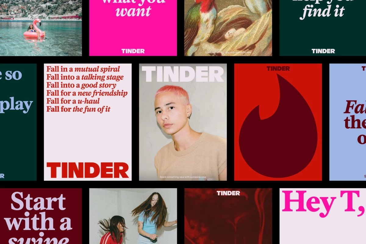
Tinder’s assets were never the issue. Its meaning was. The category it invented has spent years being described by its own users as exhausting, and an app whose founding promise was volume needed to start claiming something else. So Porto Rocha kept the flame, redrew it sharper, set the wordmark in all caps, brought in a serif with some editorial nerve, and widened a palette of reds and pinks to take in blues and greens.
Then it did the part that actually matters. The identity is built around T, a fictional dating columnist who carries the brand’s voice through the app, and the line “happily ever after” becomes “happily TBD”. You can argue with the execution. You cannot call it a refresh. Tinder changed what it is claiming about dating, and the design followed the claim. “We wanted to make space for contradiction within the brand,” Porto Rocha’s strategy and copy director Natalee Ranii-Dropcho told It’s Nice That. Contradiction is a meaning problem, and no amount of asset governance touches it.
Which one you need depends on whether the meaning still holds
The test is not how dated your logo looks. It is whether the sentence your brand is making is still true.
| Brand refresh | Rebrand | |
|---|---|---|
| What is broken | Application. The same brand arriving differently in every market, channel and deck. | Meaning. The story no longer matches the business or the market. |
| What changes | Nothing famous. You amplify what you already own and fix how it gets used. | Position, voice, and whichever assets carried the old promise. |
| Where the money goes | Systems, tools, training, governance. | Strategy first, identity second. |
| The risk | You pay for design and nobody notices anything. | You throw away recognition you cannot buy back. |
| July 2026 | Coca-Cola | Tinder |
Most briefs that arrive asking for a rebrand are describing symptoms from the left column. The site looks like a different company from the trade stand, which looks like a different company from the investor deck, and someone senior has reasonably concluded the brand feels tired. Usually it is not tired. It is being applied by forty people with no shared instruction and no way to check their work.
Most brands do not own enough to be worth amplifying
There is a catch in the Coca-Cola strategy, and it is why it does not transfer wholesale. Amplifying your assets only works if you have assets worth amplifying.
JKR, the same agency, ran research with Ipsos across more than 26,000 consumers in 25 countries, testing 5,046 assets belonging to 523 brands. Only 15% qualified as gold, meaning recognisable on their own with the name taken off. Another 20% came in silver, and 65% were bronze: weakly associated with the brand paying for them. Two thirds of what companies are busy protecting is not, on that evidence, doing any recognising.
So the order matters. If your assets are bronze, consistency will only make you consistently invisible. Settle what you want to be known by first, commit to fewer things than feels comfortable, and then build the system that keeps them turning up.
Amul has been running the same brand since 1966
The best long-run proof of the Coca-Cola approach is not in the trade press. Amul’s topical hoardings have run continuously since 1966, when Sylvester daCunha’s agency took the account and gave the brand a blue-haired girl in a polka-dot dress, drawn by art director Eustace Fernandes. Sixty years and thousands of executions later, the format is untouched: the girl, the pun, the headline of the day. Writing in The National in 2019, Tania Bhattacharya recorded Rahul da Cunha’s read on why the mascot has lasted, that she could comment on sensitive subjects without offending anyone.
Amul never refreshed in the agency sense of the word. It kept one asset and used it more often, and for longer, than anyone else was willing to. That is the entire method, and it is available to a company of any size. Consistency is not a budget. It is a refusal to keep starting again.
Which brings it back to your own situation. If the promise underneath your brand is still the one you want to make, you have a consistency job, and it is cheaper and less dramatic than the thing you were about to commission. If the promise is no longer true, no system will rescue it, and you are looking at strategy before anyone opens a design file. Two of the most watched brands in the world just worked through that fork in public, days apart, and gave opposite answers. Both of them were right.
Frequently asked questions
What is the difference between a brand refresh and a rebrand?
A refresh keeps your positioning and fixes how consistently the brand arrives: same assets, applied better. A rebrand changes the meaning, which usually means new positioning, a new voice, and often new assets. If the promise underneath is still true, you need a refresh.
How do I know if my company needs a rebrand?
Ask whether the sentence your brand is making is still true. If it is, and the problem is that your website, your deck and your packaging look like three different companies, that is a consistency job. If the promise no longer matches the business or the market, that is a rebrand.
What are distinctive brand assets?
A colour, a mnemonic, a mascot, a typeface or a line that people recognise as yours with the name taken off. Research by JKR and Ipsos across 5,046 assets found only 15% were recognisable on their own, so most brands own fewer real assets than they think.
Campaign imagery remains the property of the respective brands and agencies, shown here as editorial reference with credit.