
Why the Alpes 2030 logo says nothing about the Alps
It is not a design failure. It is a decision one.
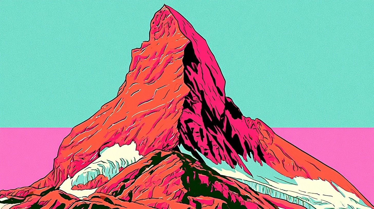
On June 18, 2026, the organising committee for the Alpes 2030 Winter Olympics unveiled their official mnemonic. A triangle, rendered in gradient. Azure at the peak, fading through rose-pink to alpenglow red at the base. Studio Saint-Lazare, based in Paris, designed it.
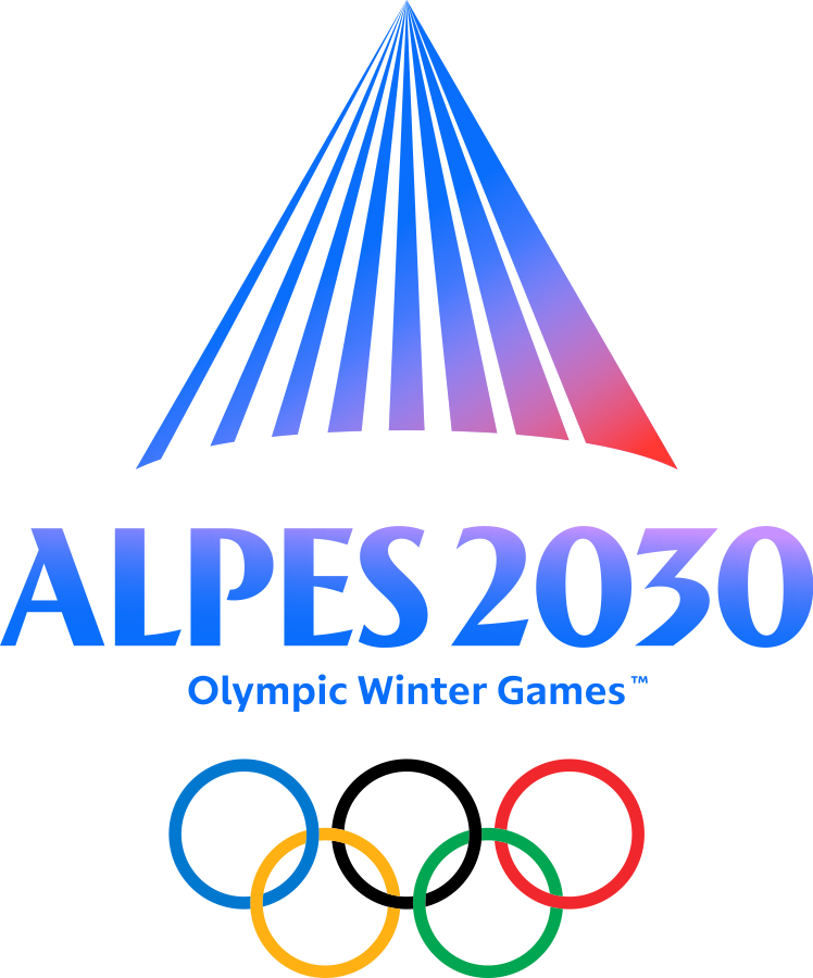
It is competent. It is contemporary. It could belong to a skincare brand. A Nordic hotel group. A private equity firm with an outdoors sub-theme.
That last observation is not a creative slight. It is a diagnostic. The question worth sitting with is not whether the studio got it wrong. It is what the people approving it were actually deciding.
The design is not where it went wrong
The design has an internal logic. The gradient tracks a real phenomenon: the way alpine light moves from cold altitude to warm base, from blue to red, at the end of a day in the mountains. The form is a triangle, which is a mountain. The elements are correct.
What is missing is not craft. It is specificity: the willingness to make the identity wrong for somewhere else.
Compare what good decisions look like:
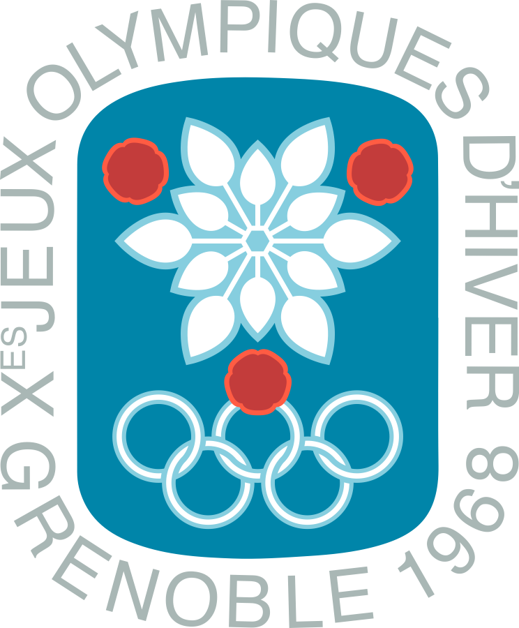
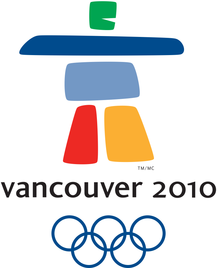

Each communicated something you could only have arrived at by deciding what this place is and what this moment is for. Paris 2024 had plenty of critics. People called it a Tinder logo, a face cream ad. But “is this a good logo?” is a different question from “did the people behind it make a decision?” They did. That is what we are talking about. Each of these identities would feel wrong somewhere else.
The Alpes 2030 mnemonic made no such decision. It could be transposed to a dozen different contexts without losing anything, because there is nothing specifically alpine left to lose.
The decision that was not made
Every brand identity is a decision. Not about colour or form, but about what you are willing to be specific about and what you are not. The specificity is not decoration. It is the argument. Without it, a design has no position to hold.
Olympic identities carry a particular version of this challenge. They must work across dozens of languages, contexts, and stakeholder groups. They must serve both the Olympic and Paralympic games. They must read on a ticket stub and on a stadium roof. These are all legitimate constraints, and together they are also instructions to remove everything that makes an identity belong to a particular place.
What tends to get decided: make it modern, make it versatile, make it broadly appealing. What does not get decided: what this place means, what feeling the identity should leave, what the mnemonic would lose by belonging somewhere else.
The French Alps are not a neutral backdrop. The scale of the terrain is a character in itself. Grenoble, the host city, sits where three mountain ranges meet. The light at altitude is a different quality from anywhere else in Europe. The mnemonic could have carried some of that weight. Instead it was optimised for universality until no trace of the place remained.
The result is an identity that no one objects to and no one remembers.
What this means if you are briefing a rebrand
The brief you hand a designer is not a technical document. It is a record of the decisions you have already made, or a record of the ones you are quietly avoiding.
The most common failure mode in a brand project is not bad execution. It is a brief that asks for everything and therefore permits nothing specific. Works across all contexts usually means works fully in none. Modern with broad appeal usually means nothing with a visible point of view.
Before you brief anyone, answer one question honestly: what would make this identity wrong for someone? If the answer is nothing, you have not decided anything yet. You have written instructions for something that could belong to anyone.
The Alps are still there. Specific, extreme, and entirely themselves. The mnemonic just decided not to be.