


BankBazaar
Identity for BankBazaar, an online financial marketplace, with the most important symbol in its business built into its name.
Identity · Brand world · Product · Motion
THE CONTEXT
WHAT WE DID
When people compare loans and cards, a percentage can carry more weight than a page of promises. For BankBazaar, that simple truth offered a way to make the brand instantly relevant.
We turned the ‘z’ in BankBazaar into a percentage sign. A small intervention gave the wordmark a direct connection to the reason people use the platform: comparing the numbers before making a decision.
INDUSTRY
ENGAGEMENT
Fintech
Identity, Brand world


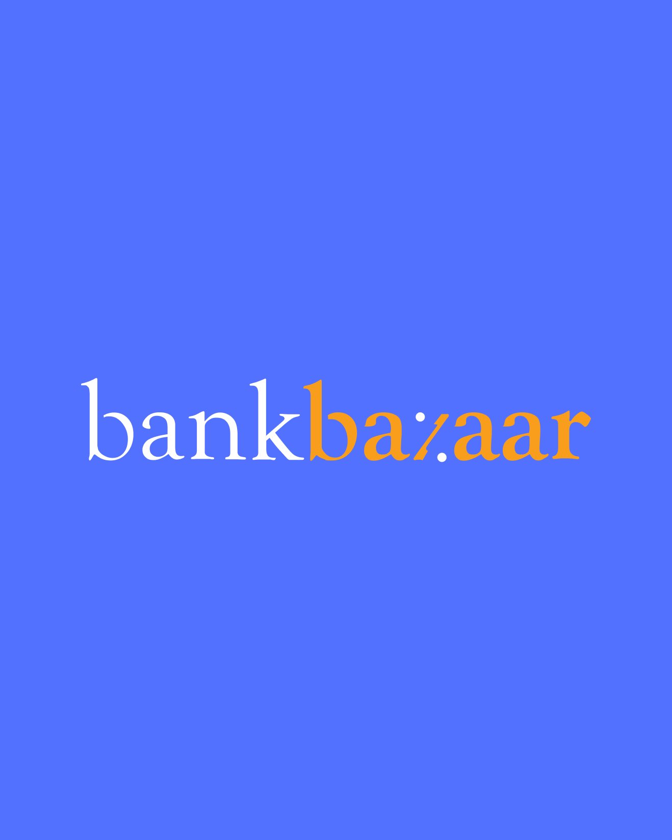




Fingerprints Creative created the identity and brand world for BankBazaar, an online financial marketplace for comparing loans and cards. The idea was to make the brand relevant at the point of recognition. Turning the 'z' in BankBazaar into a percentage sign connects the wordmark to the rates people compare, giving the name a direct relationship to the service.
ALL WORK


