


TRNSFR
Naming and identity for TRNSFR, a contemporary fashion label with a distinctive point of view on premium everyday wear.
Naming · Identity · Packaging · Retail
THE CONTEXT
WHAT WE DID
TRNSFR entered a fashion landscape shaped by European and Korean influences, where new labels compete as much on attitude as on product. It needed a name and presence that could hold their own.
We chose TRNSFR, a name that suggests movement and change. Its wordmark lives on an edge, creating a distinctive rule for the brand without needing more decoration.
INDUSTRY
ENGAGEMENT
Fashion
Naming, Identity


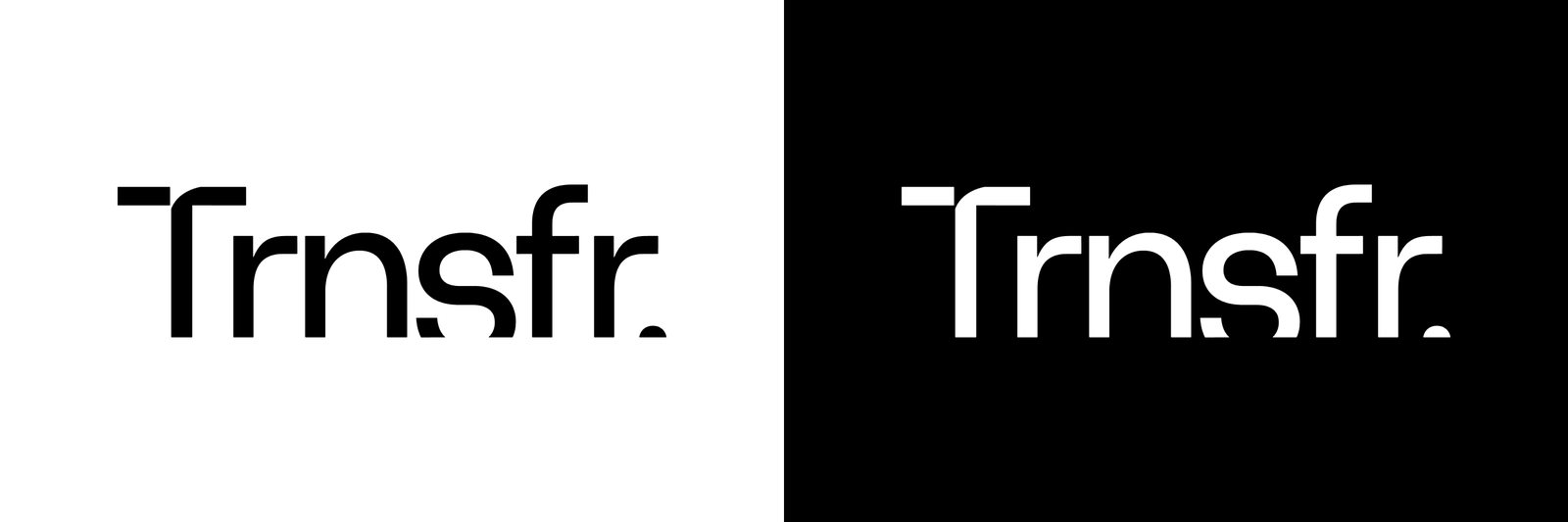


Fingerprints Creative developed the naming and identity for TRNSFR, a contemporary fashion label offering premium everyday wear. In a market influenced by European and Korean fashion, the label needed an attitude people could recognise. The name suggests movement and change. A wordmark positioned on an edge gives that idea a defining visual expression across the brand.
ALL WORK
