
Most logos are answers to the wrong question
Or: why “make us a great logo” is a brief with nothing in it.
Here’s the question almost every logo brief actually asks: what should we look like. Here’s the question it should ask instead: what have we decided. Brand strategy versus logo design isn’t a semantic argument. It’s the difference between a mark that holds up and one that just photographs well in the pitch deck.
A logo is a mnemonic, not a strategy. It’s the shorthand for a decision, the visual trigger that recalls everything a customer already believes about you. If the decision underneath is real, the mnemonic works. If it isn’t, you’ve just spent a lot of money on a nicer-looking guess.
You can usually tell a logo brief is standing in for an undecided strategy question by the symptoms around it. The mark gets redrawn three times and still feels off. Everyone in the room likes a different option, for different reasons, because there’s no shared decision to check the options against. The designer starts asking about “personality” and “feel,” which are the questions you ask when the harder questions, what this company is for and who it refuses to serve, haven’t been answered yet. None of that is a design failure. It’s a business that hasn’t decided something, wearing a moodboard.
Two redesigns show exactly how this plays out, in opposite directions.
When the logo tries to do the strategy’s job
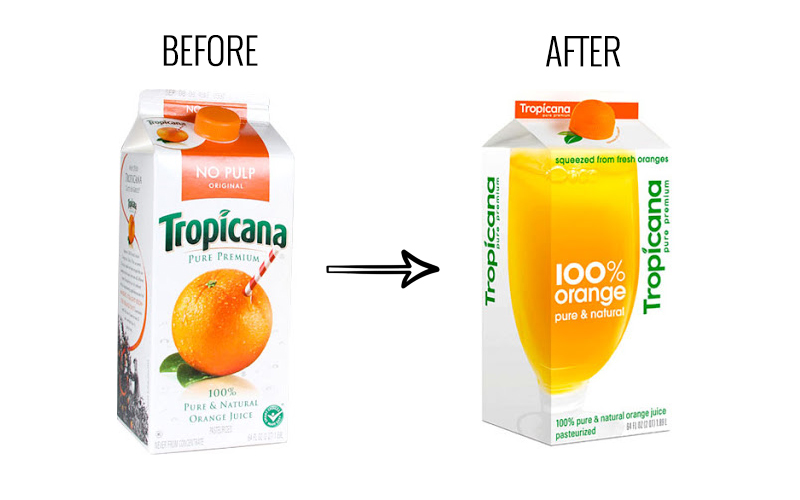
In January 2009, Tropicana replaced its Pure Premium carton, the one with the orange stabbed by a striped straw, with a plain glass of juice. The agency behind it said the goal was to bring the brand “into a more current or modern state.” That’s a design answer to a question nobody had actually asked. What was the strategic problem the old carton had? There wasn’t a clearly stated one. The brief chased a look, not a decision.
Within two months, unit sales had fallen roughly 20%, about $30 million, on top of a $35 million ad campaign built around the new packaging. Tropicana’s own leadership later admitted they had underestimated the emotional bond shoppers had with the original image. Customers weren’t rejecting the new design on taste. They were failing to find their juice on a crowded shelf, because the one thing the old mark was doing, working as a recognition device, had been redesigned away without anyone deciding that trade-off was worth making. Six weeks after launch, Tropicana reverted.
Nothing about the new carton was ugly. That was never the problem. The problem was that “modern” isn’t a decision. It’s a mood, and moods don’t hold a shelf.
When the decision comes first, the logo can do more, not less
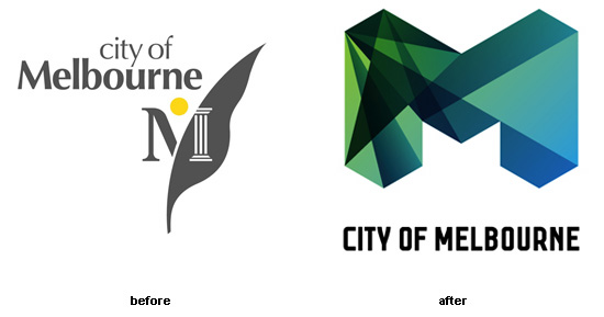
Melbourne’s city identity is the useful counter-case, because it looks like the riskier move and turned out to be the more disciplined one. Before any design work started, Landor ran a seven-month process of stakeholder interviews and audits across the city’s institutions, which had drifted into dozens of conflicting visual identities with nothing holding them together. The strategic question got answered first: what does one city government actually need a mark to do, when a gallery, a council office and a tram service all have to feel like the same place without feeling like the same brochure.
The answer wasn’t a fixed logo. It was a bold “M” built to be redrawn, filled, and reinterpreted differently by different parts of the city, reportedly into more than a hundred variations, while still reading as one identity. That only works because the decision was locked before the design was: the mark’s job was to unify a fragmented city, not to look identical everywhere. Once that was settled, a hundred versions of the same letter stopped being chaos and started being the point.
The test before you brief anyone
You don’t need a design team to run this test. You need three honest answers.
What are we for. Who, specifically, are we not for. What would we refuse to compromise on even if it cost us a customer. If you can say those out loud without hedging, you’re ready to brief a designer, and the brief will actually be usable. If you can’t, what you have is a wish list dressed as a project, and no amount of craft fixes an undecided question.
The difference shows up immediately in what the designer is allowed to do. A brief without decisions produces options: a rounder version, a flatter version, a version with a slightly different blue, each one defensible and none of them better than the others in any way you could argue for. A brief with decisions produces a filter. Melbourne’s brief effectively said: any version of this mark is right if it still reads as one city holding many voices together, and wrong if it doesn’t. That’s not a taste call anymore. It’s a test, and tests are what let a designer actually finish the job instead of circling it.
As one brand strategist put it plainly on Substack, splitting brand strategy from design strategy: the logo and the palette “are outputs of design strategy,” and design strategy itself is just “the bridge between abstract brand positioning and tangible brand experience.” Skip the bridge’s foundation and you’re building over open air. It might hold for a season. It won’t hold for long.
Start with the decision, not the mark
Tropicana’s carton and Melbourne’s “M” both changed a lot of visual equity at once. One did it without a decided reason customers could feel, and lost the shelf. The other did it because of a decided reason, and turned apparent inconsistency into its whole advantage.
So before the next brief goes out, don’t ask what the logo should look like. Ask what you’ve actually decided. The logo was never going to answer that question for you. It was only ever going to say it out loud.
Campaign imagery remains the property of the respective brands and agencies, shown here as editorial reference with credit.