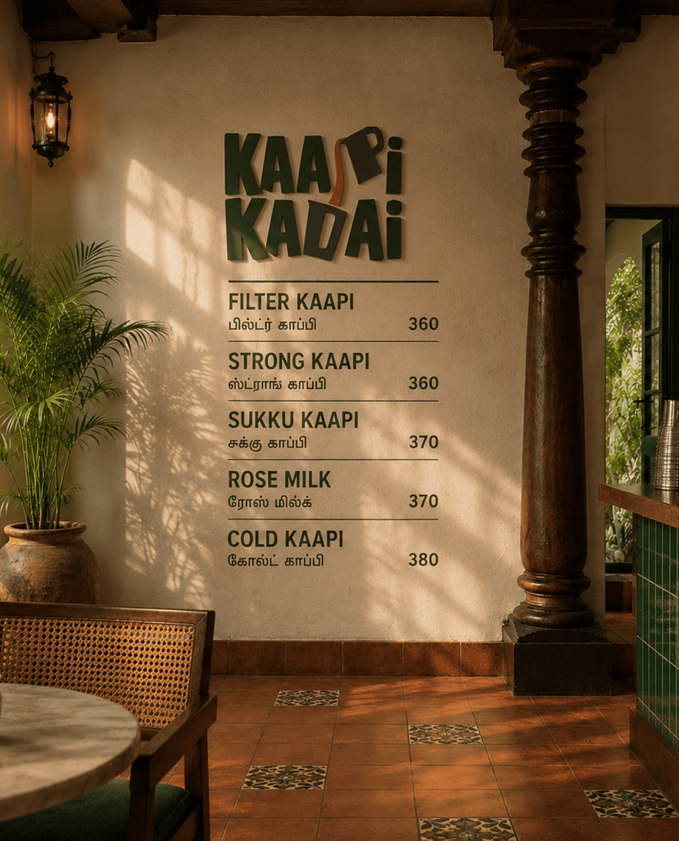
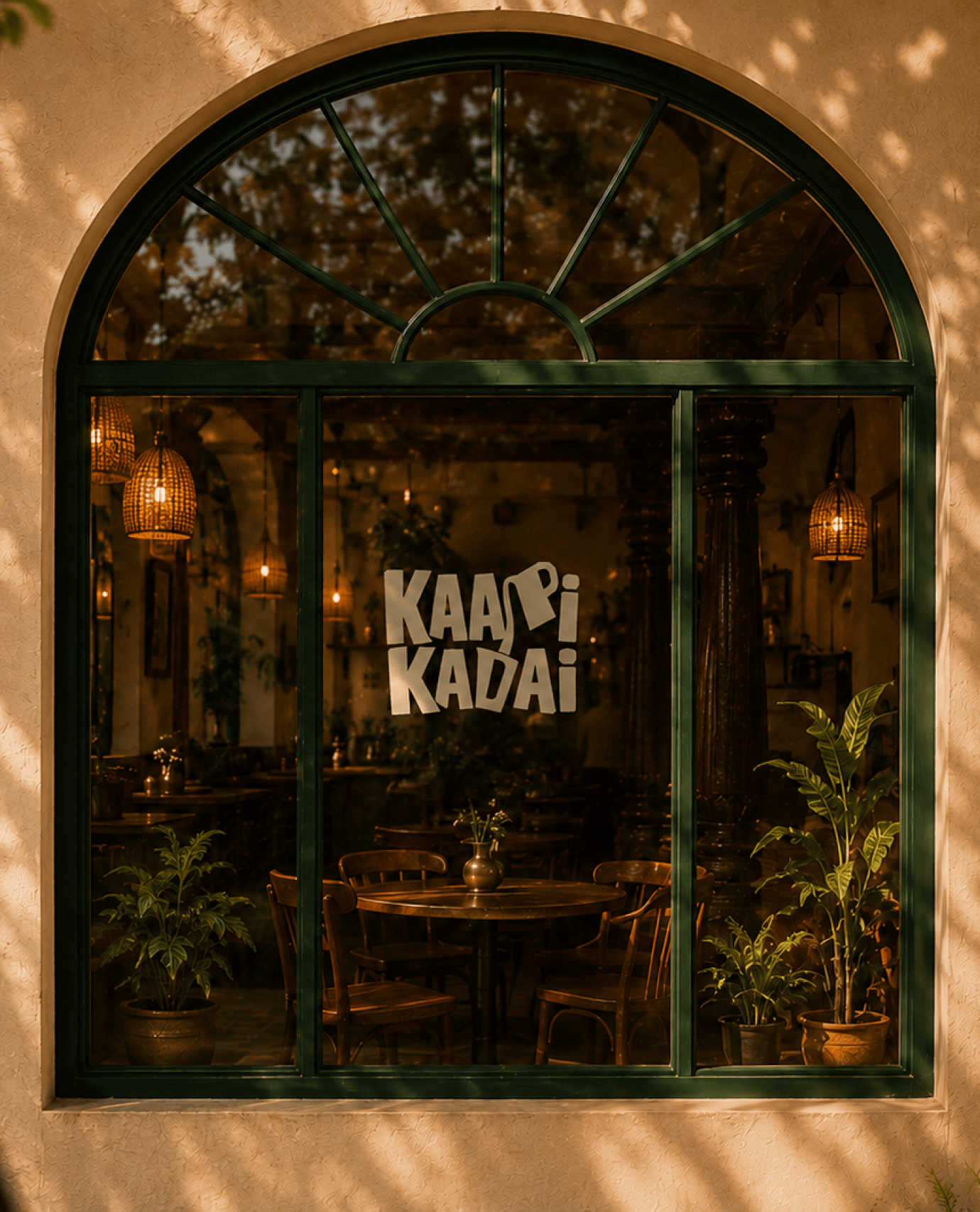
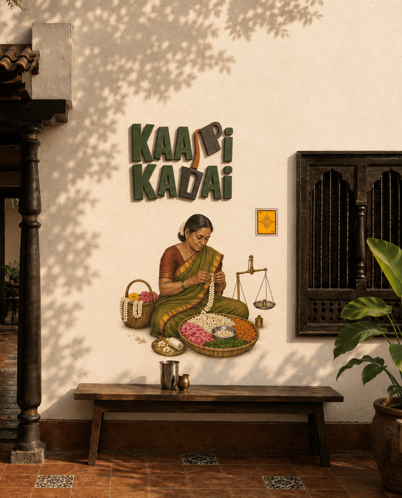
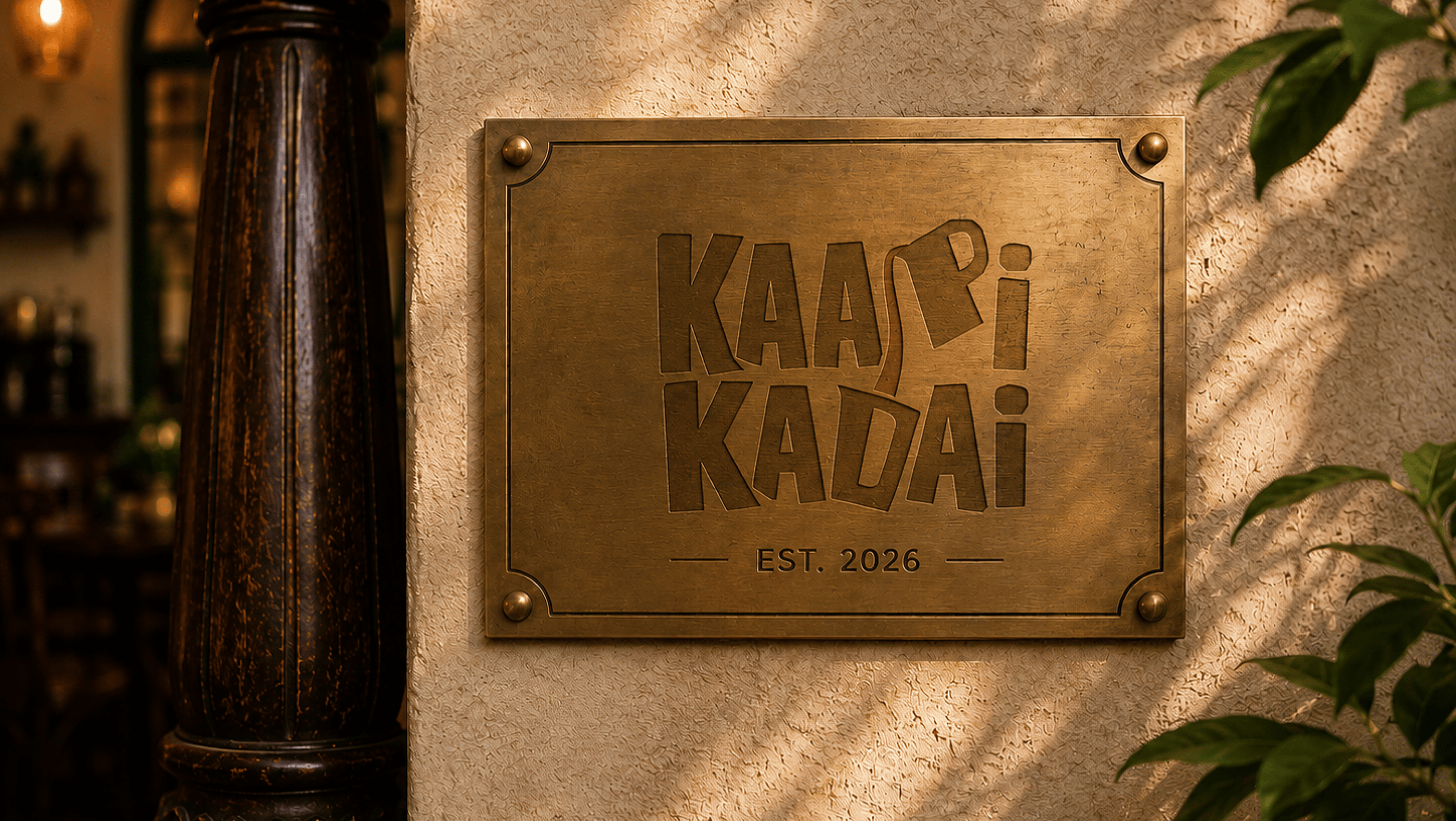
Kaapi Kadai
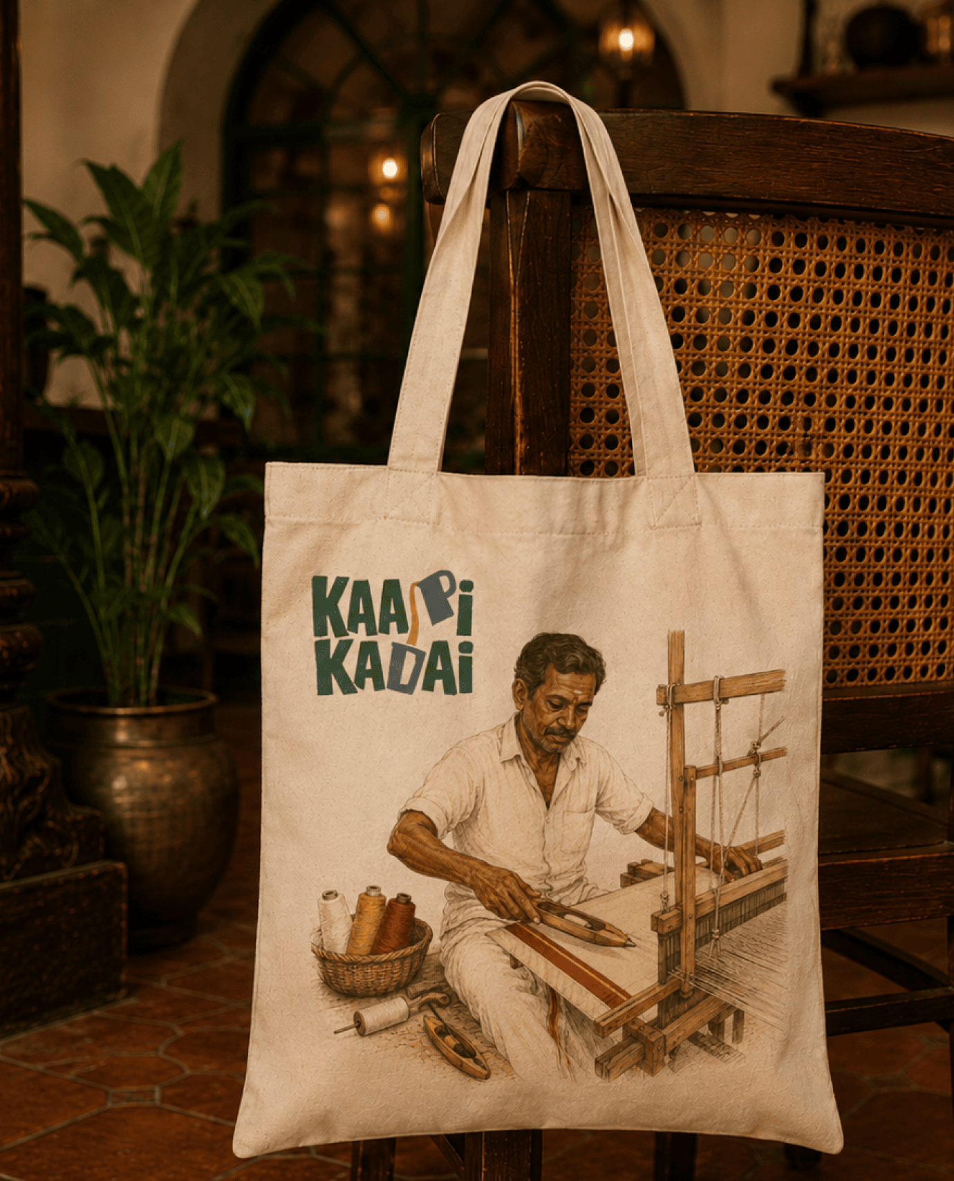
A coffee shop built on familiar faces. For Kaapi Kadai, we created a brand identity inspired by the people and moments that quietly shape everyday life in South India.
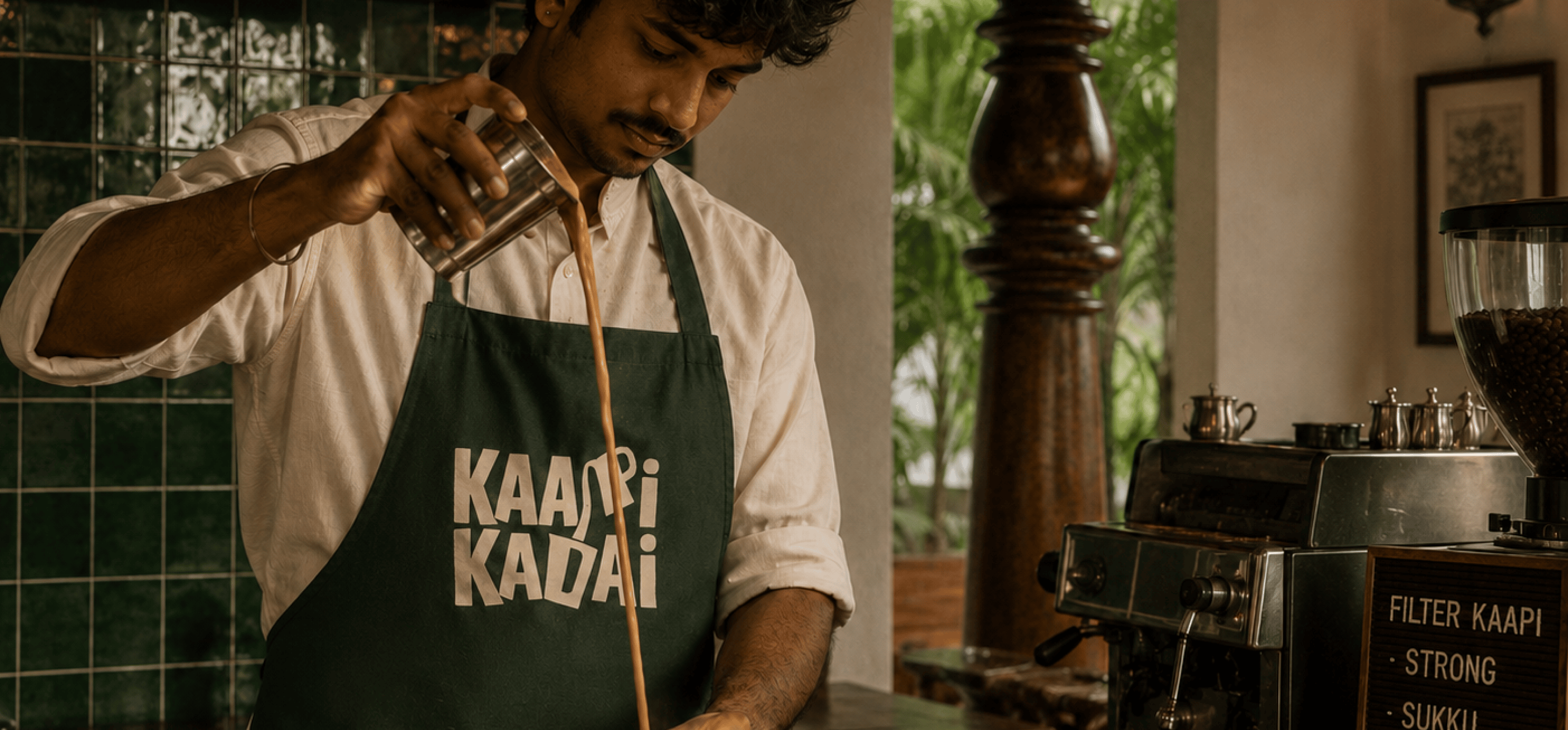
The identity pairs a simple wordmark with a growing collection of hand-drawn illustrations. Together, they create a visual language that feels warm, local, and unmistakably South Indian.
The idea wasn’t to romanticise nostalgia. It was to recognise it.
The postman. The newspaper reader. The cinema cut-out. The uncle who orders the same filter coffee at the same time every day. Small details that make a place feel lived in.
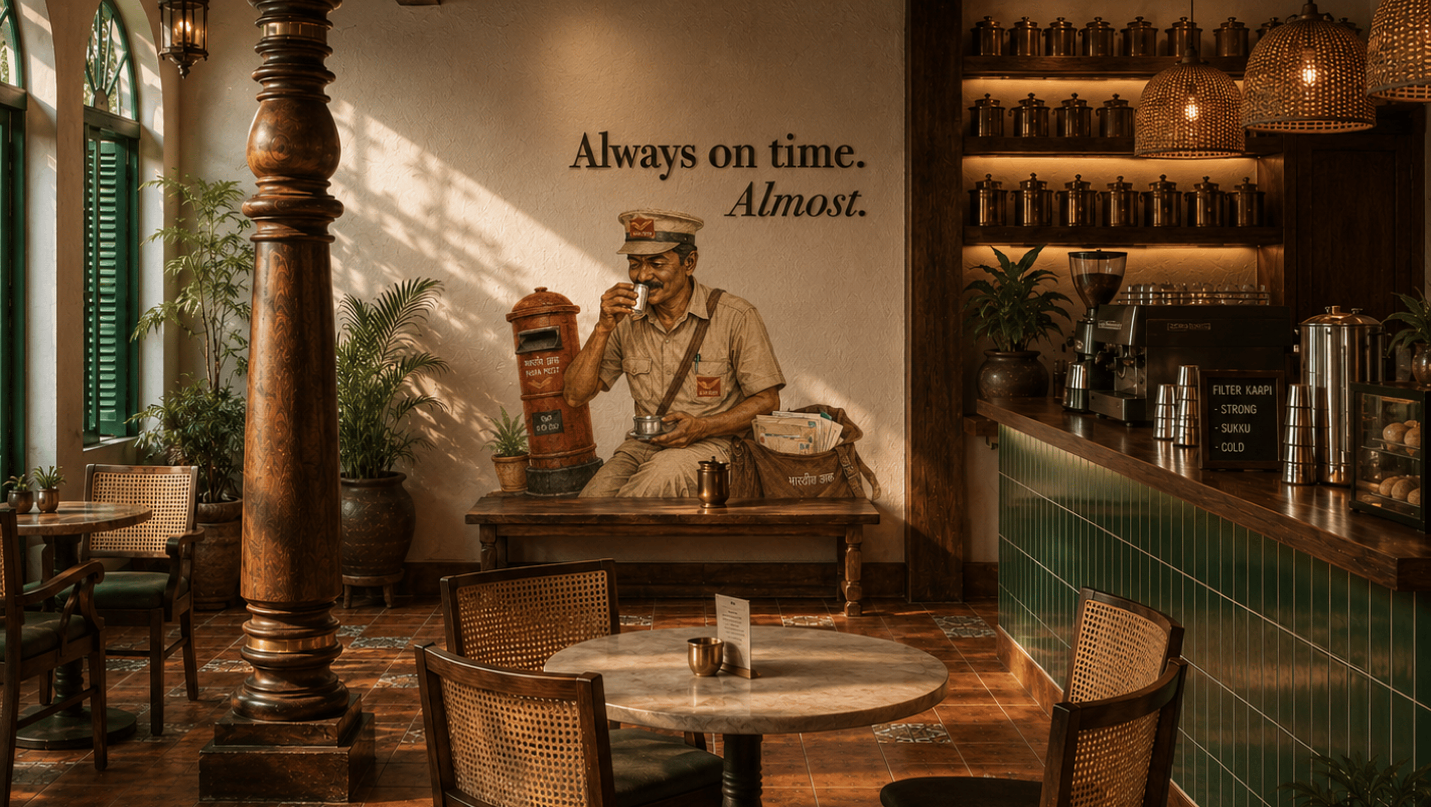
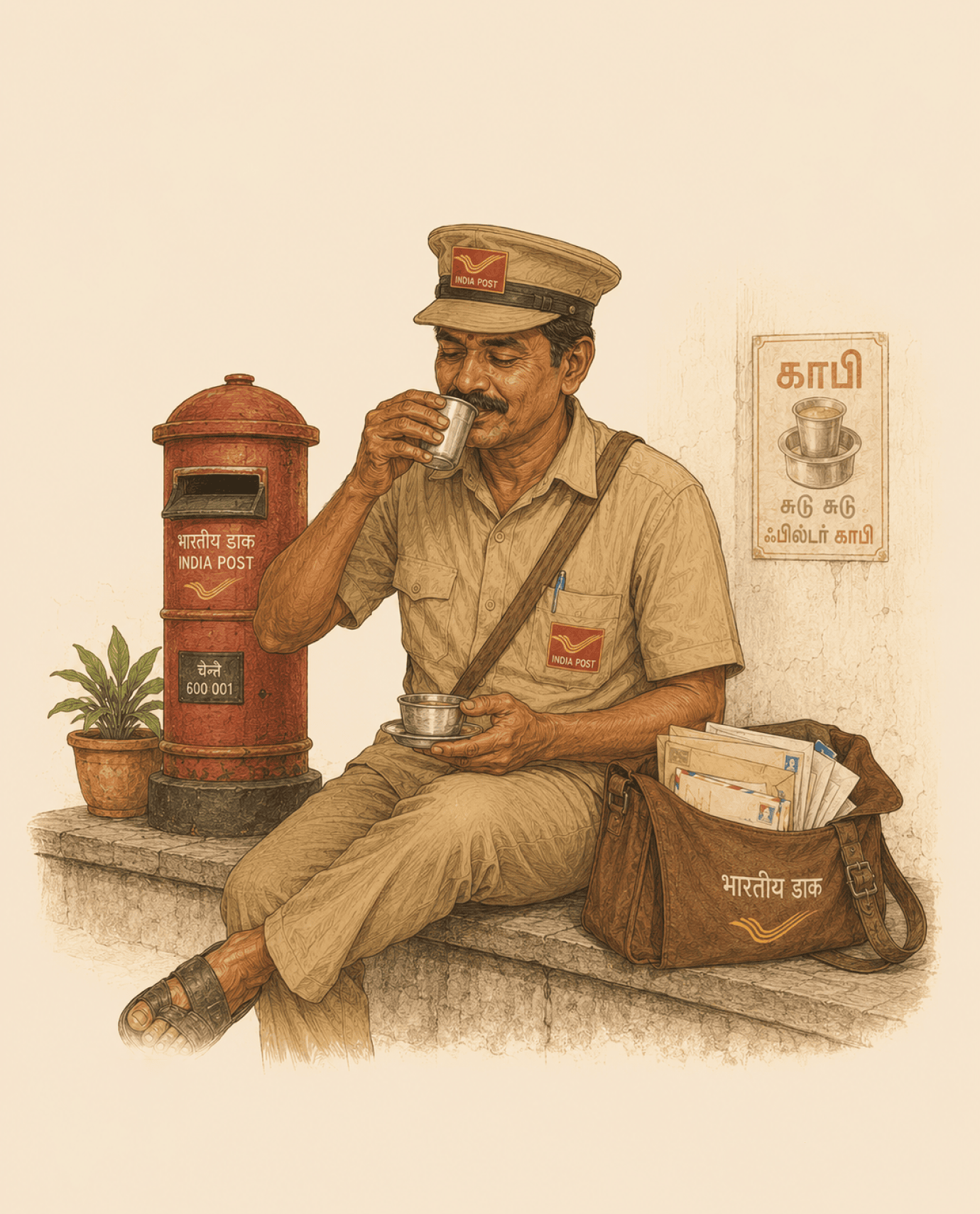
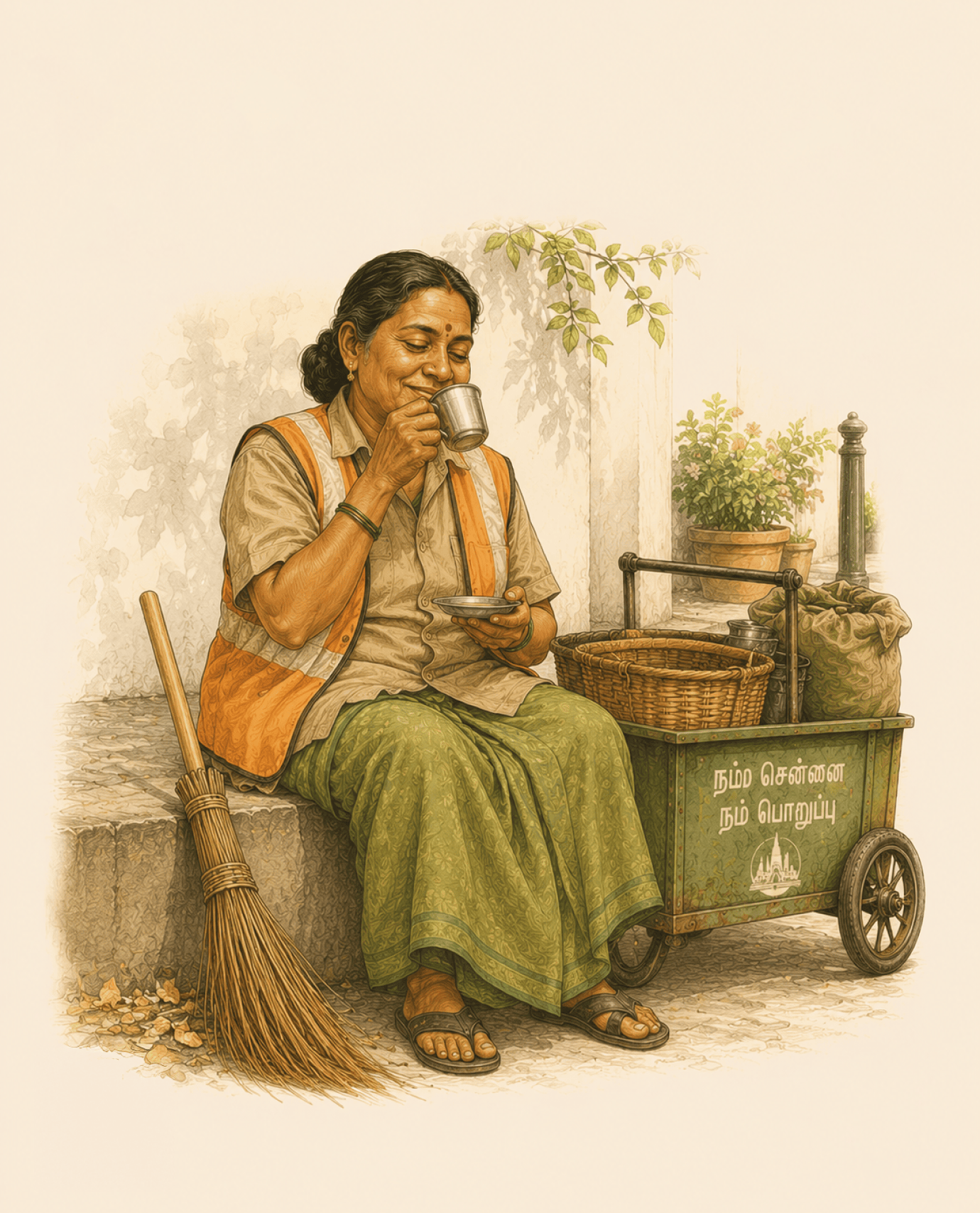
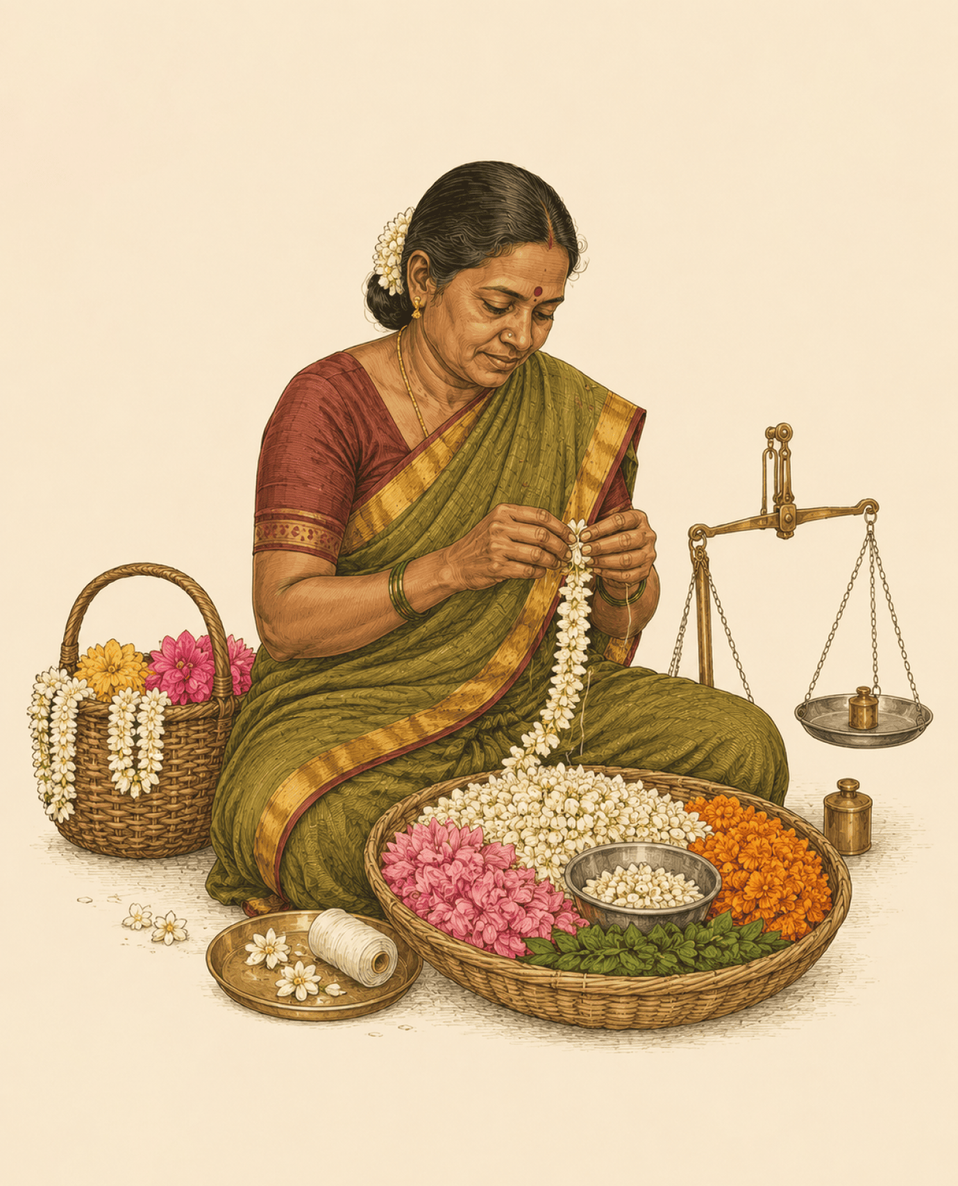
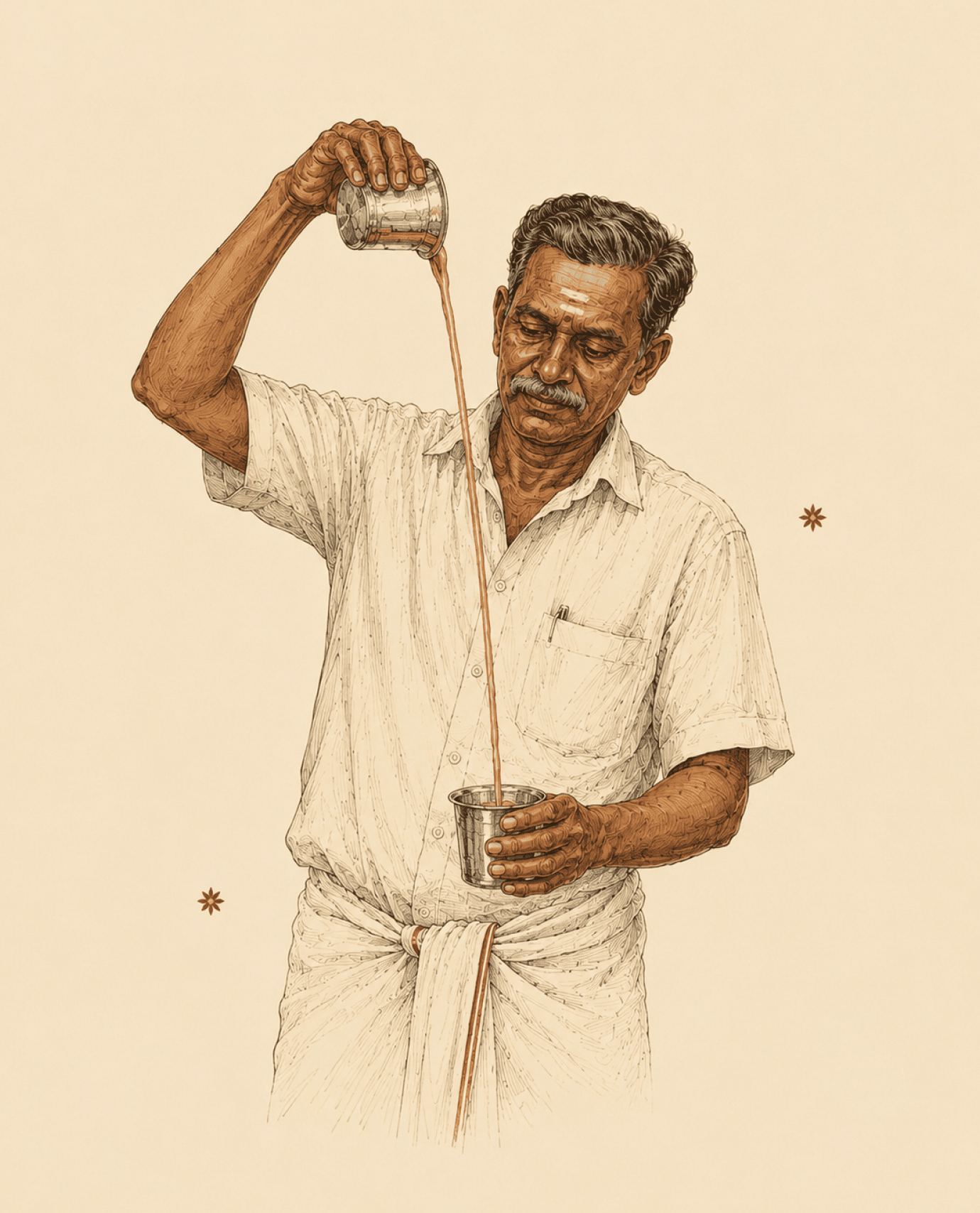
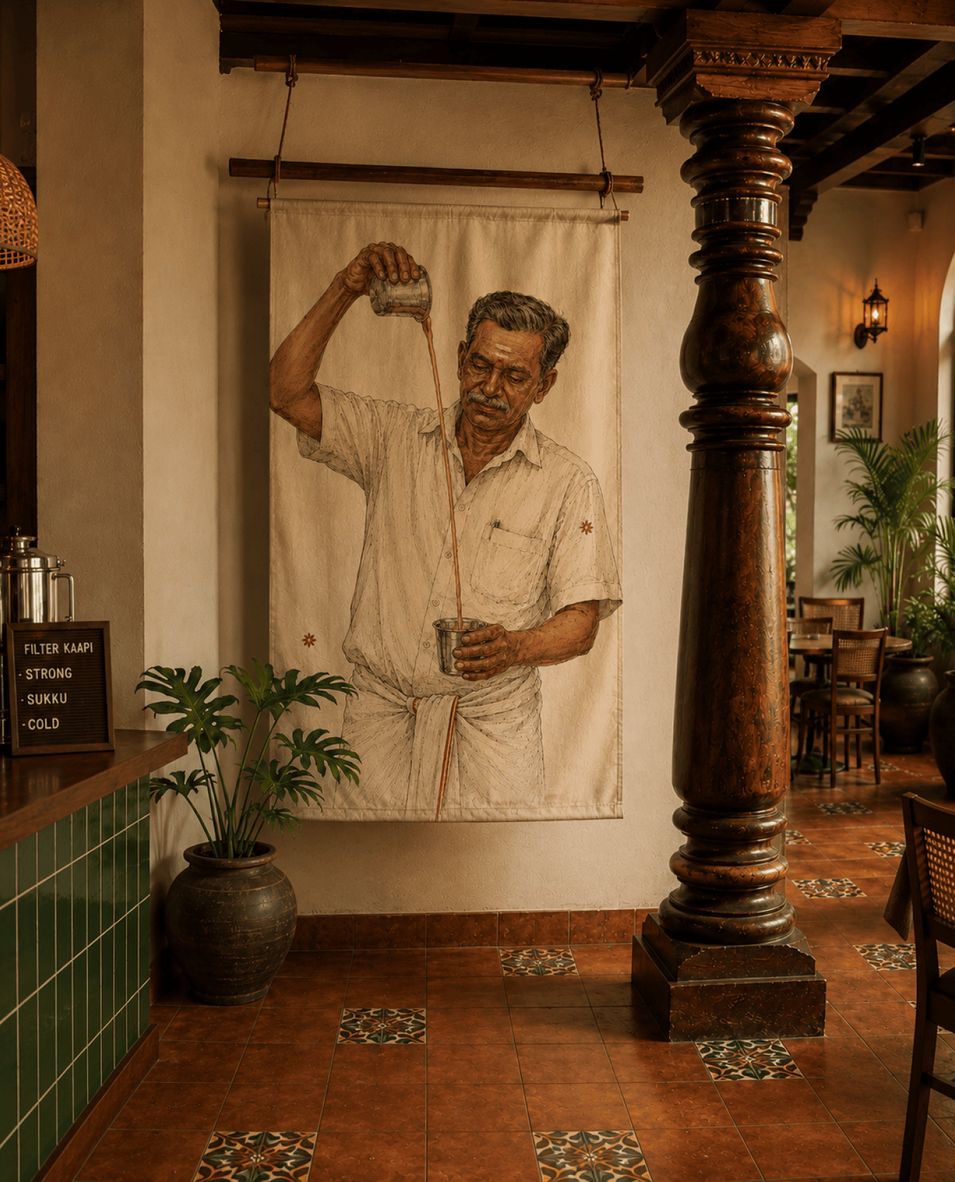
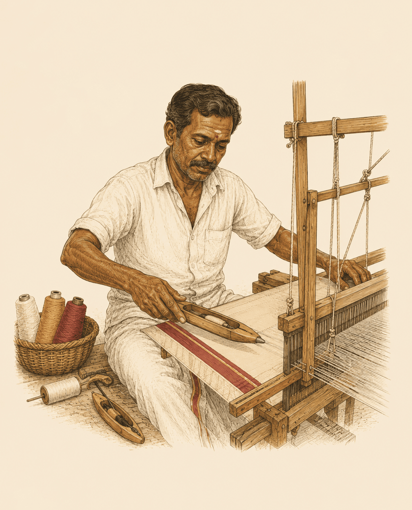
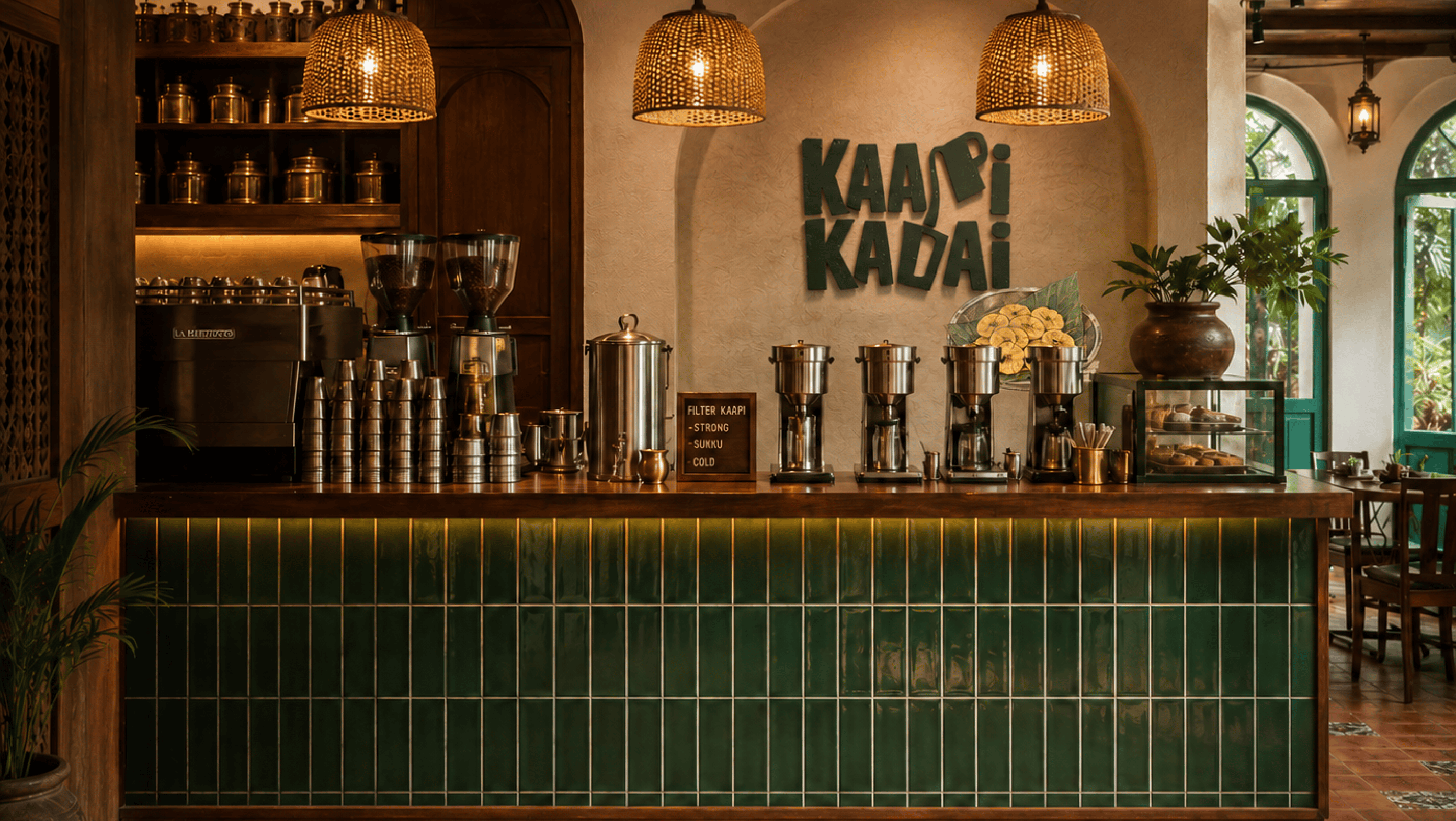
The colours draw from old matchboxes, enamel signboards and neighbourhood coffee shops. The illustrations celebrate the characters, rituals and conversations that have always belonged to Chennai’s streets and cafés. Not a coffee shop pretending to be a cultural icon.
A coffee shop rooted in South Indian coffee culture, designed to feel like it has always belonged to the neighbourhood.
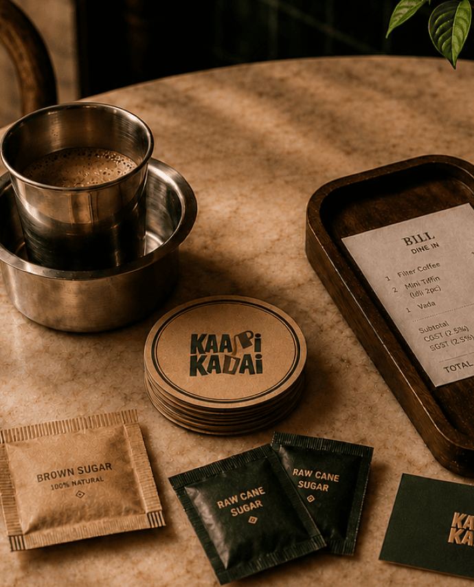
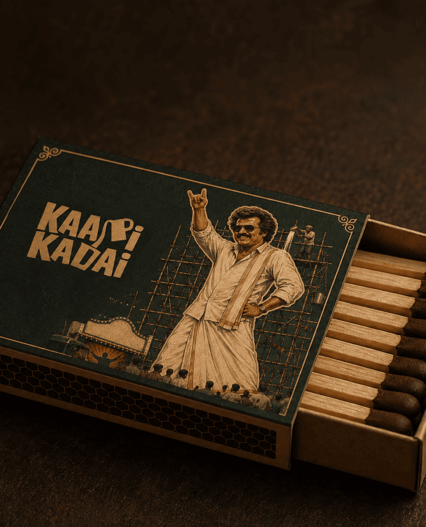
What emerged was more than a café identity. It became a brand experience built around local culture, everyday rituals and the enduring tradition of South Indian filter coffee. From signage and interiors to illustration systems, packaging and customer touchpoints, every element was designed to celebrate the people, stories and neighbourhood character that make Chennai’s coffee culture unique.