TNQ Tech
Rebranding an AI-first leader in scholarly publishing. Repositioning TNQ Tech with a scalable identity system, product architecture, and communication strategy.
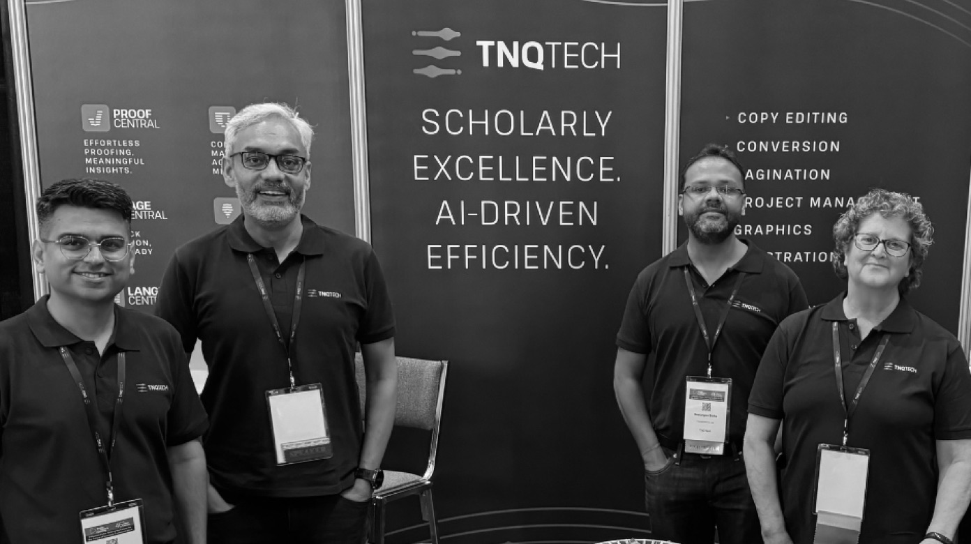
TNQ Tech is a global player in scholarly publishing. With the shift toward AI-led content technology, they needed a brand that matched their ambition - one that signaled depth, precision, and future-readiness across global markets.
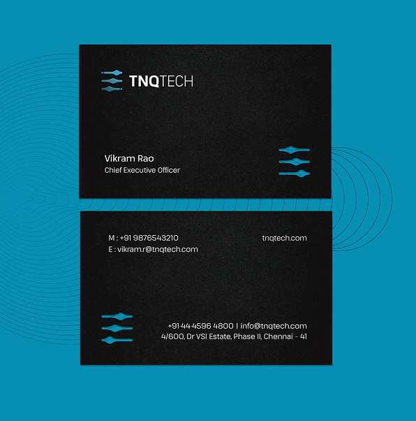

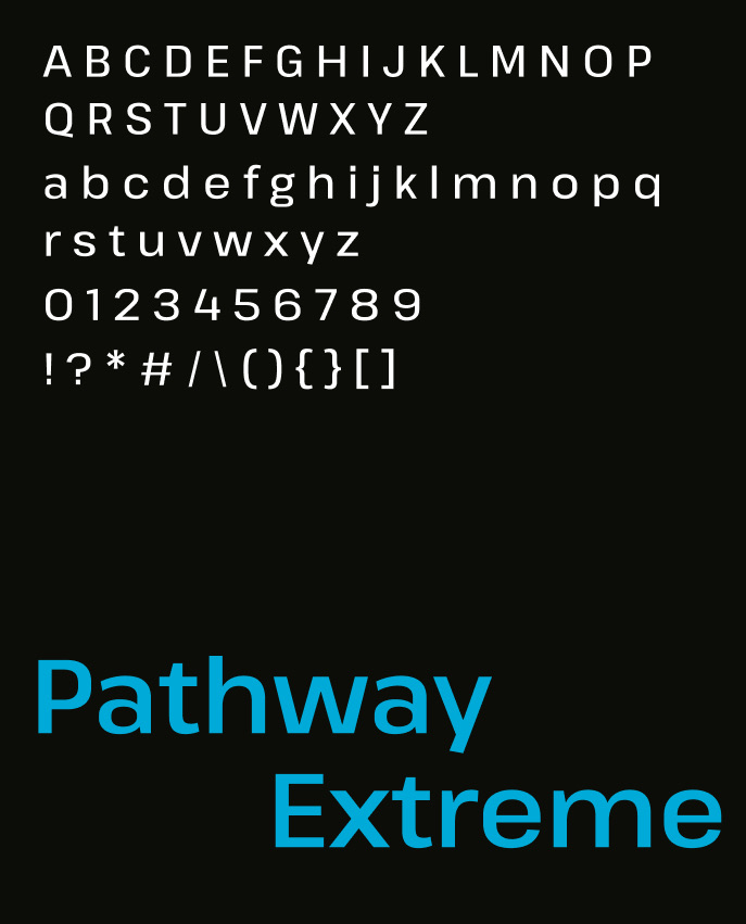
Color, Typography & Accessibility
The visual identity is anchored by a vibrant spectrum of blues inspired by light, technology, and digital interfaces. The palette creates strong recognition while providing the flexibility needed to support TNQ Tech’s diverse products, services, and communications.
A contemporary typographic system brings clarity and structure to the brand. Designed with legibility and accessibility in mind, it performs consistently across websites, presentations, reports, products, and marketing materials.
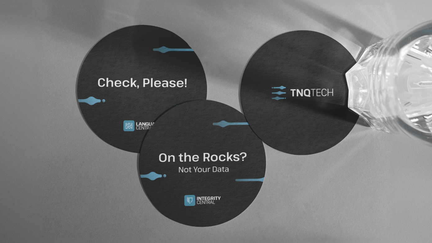
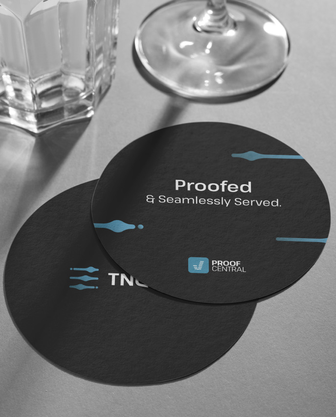
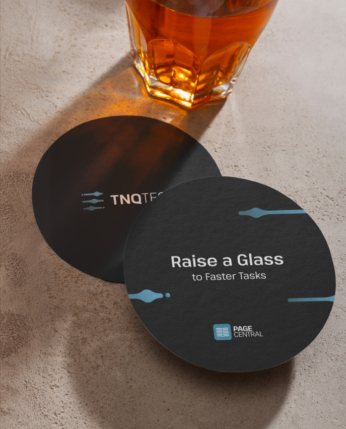
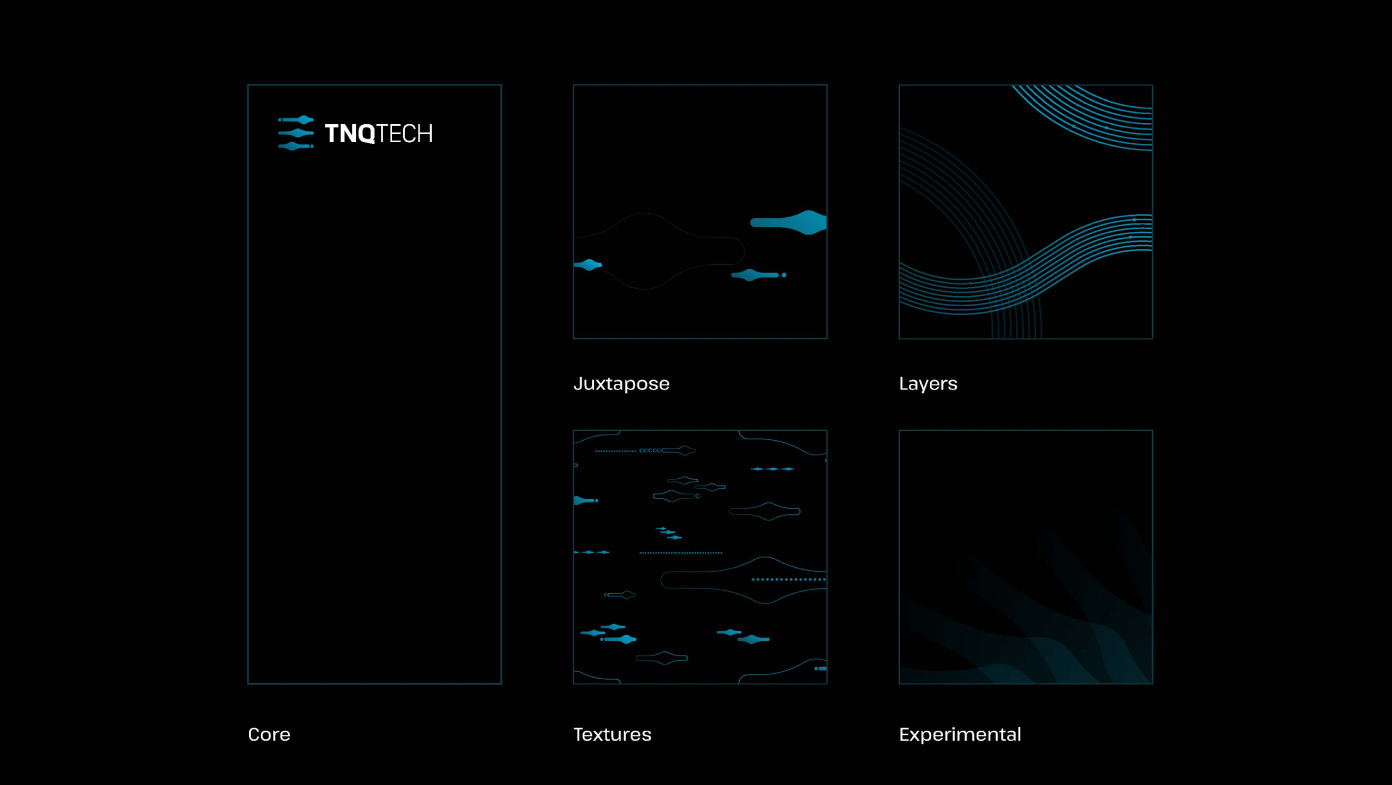
TNQ Tech Sub-Brand Ecosystem
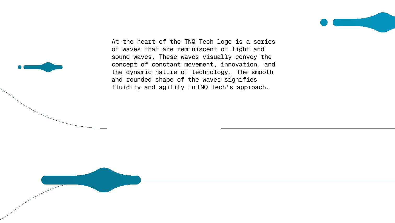
As TNQ Tech’s portfolio continued to grow, the need for a scalable and cohesive brand architecture became increasingly important. Inspired by the wave motif at the heart of the identity, a sub-brand system was developed to create consistency across products, services, initiatives, and business units.
Each sub-brand retains a clear connection to the parent identity while allowing enough distinction to communicate its unique purpose. The result is a flexible ecosystem that supports growth without fragmenting the brand.
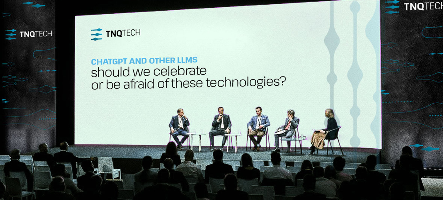
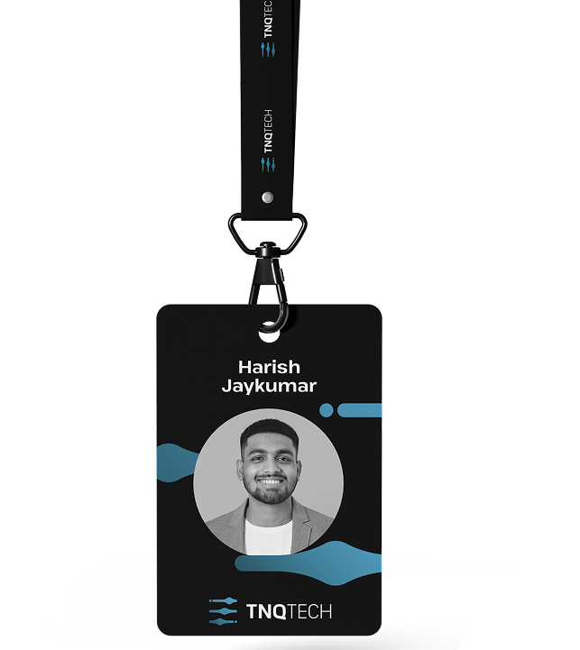
The wave motif extends beyond the logo to become a foundational part of the visual language. Through scale, repetition, layering, and composition, it creates a system that can adapt seamlessly across digital experiences, presentations, environments, and communications.
This flexibility allows the brand to remain recognisable while responding to a wide range of content and contexts.


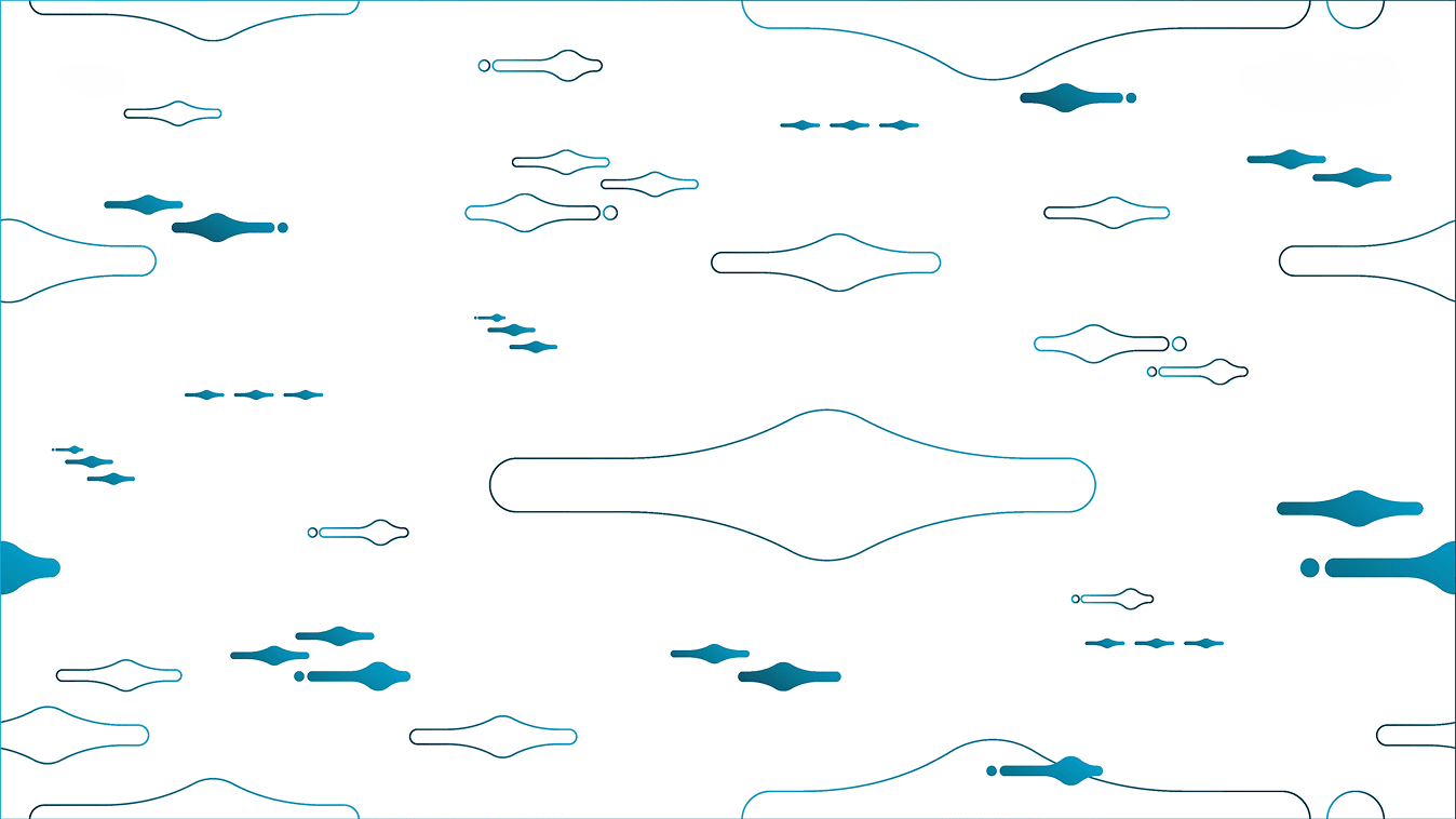
Pattern swatches
Derived from the geometry of the logo, a collection of graphic patterns was developed to add texture, rhythm, and depth to the identity. These patterns provide designers with a versatile toolkit that can be used across backgrounds, layouts, interfaces, and brand collateral.
The resulting compositions evoke movement, connectivity, and the continuous flow of information.


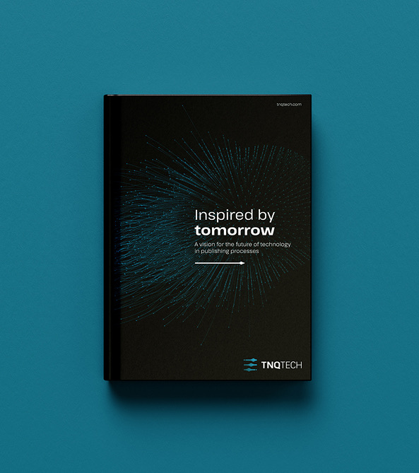
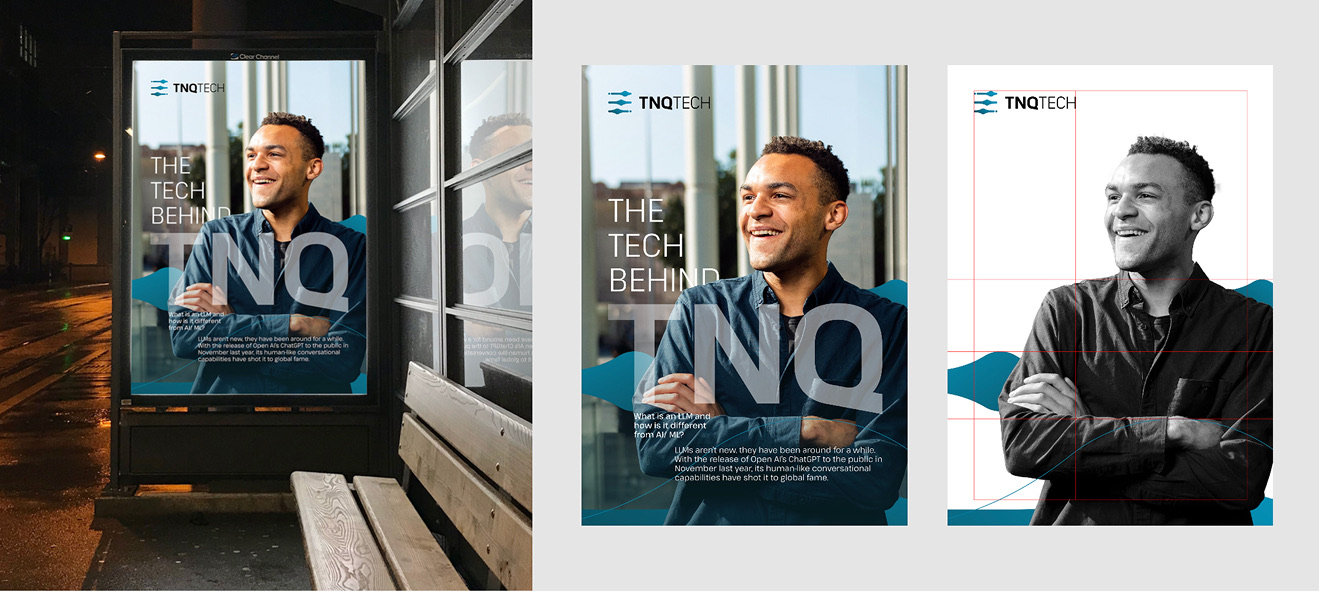
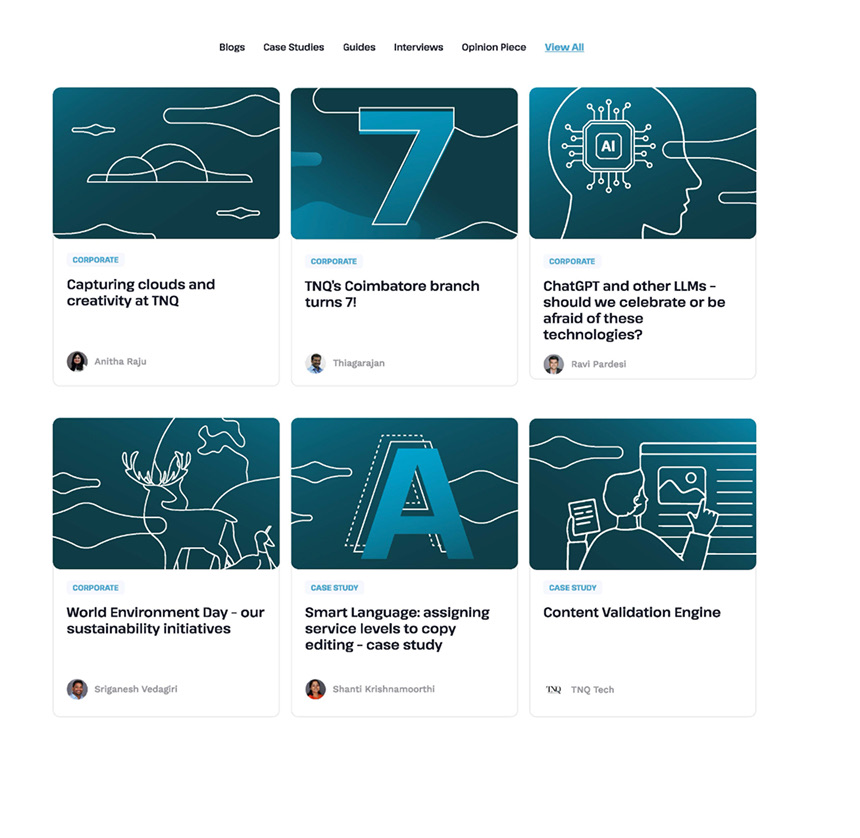
Blog Imagery
A distinctive visual approach was established for articles, thought leadership content, and editorial communications.
Iconography
A custom icon system was developed to support navigation, communication, and storytelling across the brand. Built using the same principles that inform the wider identity simple, precise, and highly functional.
The result is a cohesive technology brand built for growth, innovation, and scale. By bringing together brand architecture, digital experiences, communication systems, and visual consistency, TNQ Tech is able to communicate its expertise in content technology, artificial intelligence, machine learning, and publishing services through a single, recognisable identity.