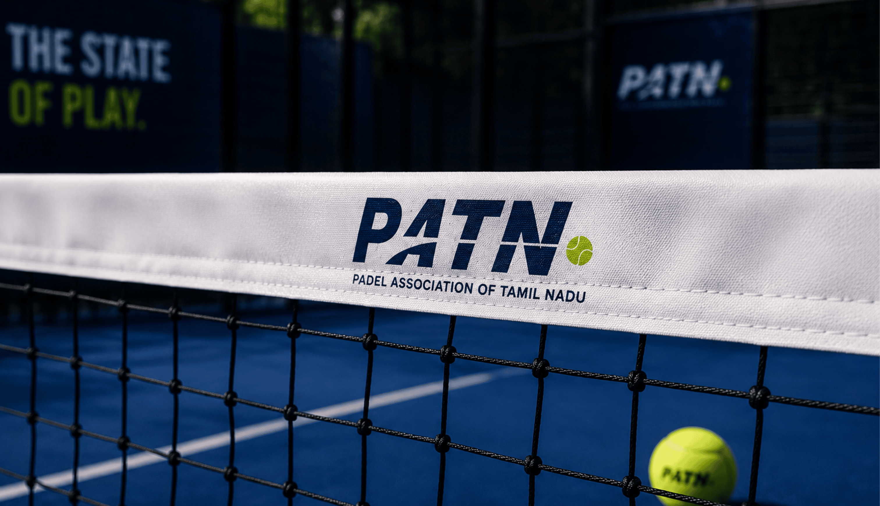
Padel Association of Tamil Nadu
Helping shape the future of padel in Tamil Nadu through a cohesive identity designed for players, tournaments and the wider padel community.
Built for the game. Designed for the movement.
The Padel Association of Tamil Nadu needed an identity built for a sport that blends precision, agility, and community. Something athletic without being aggressive. Confident without being loud.
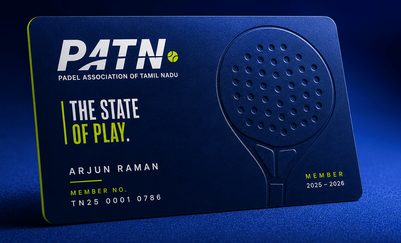
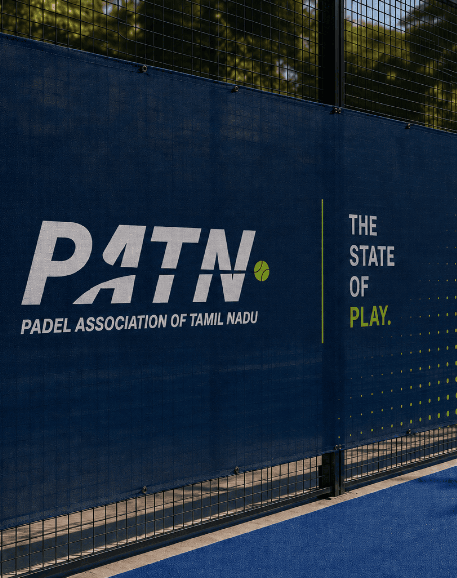
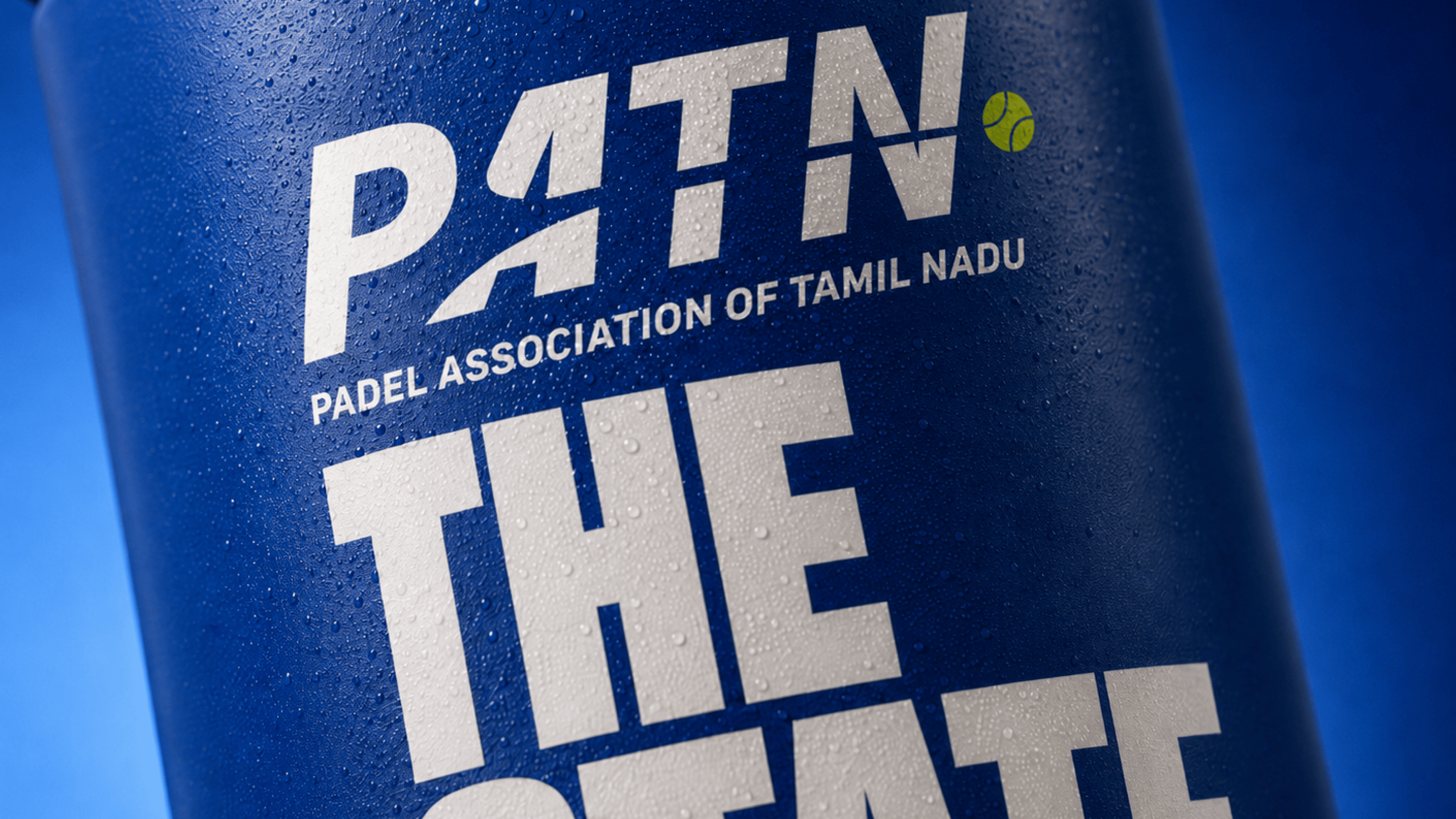
We built a custom wordmark with a 12° forward slant, diagonal cuts derived from the letterforms, and a ball element as the unit of measurement throughout the system.
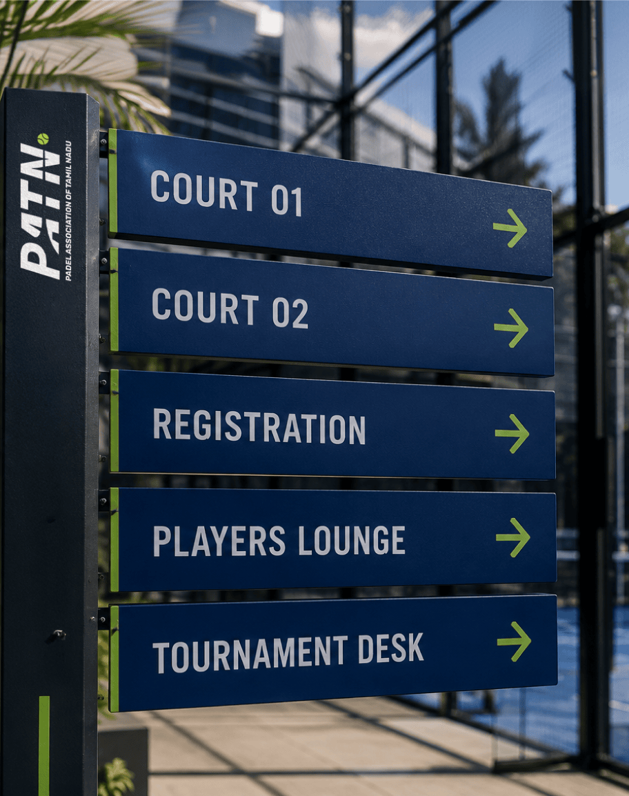
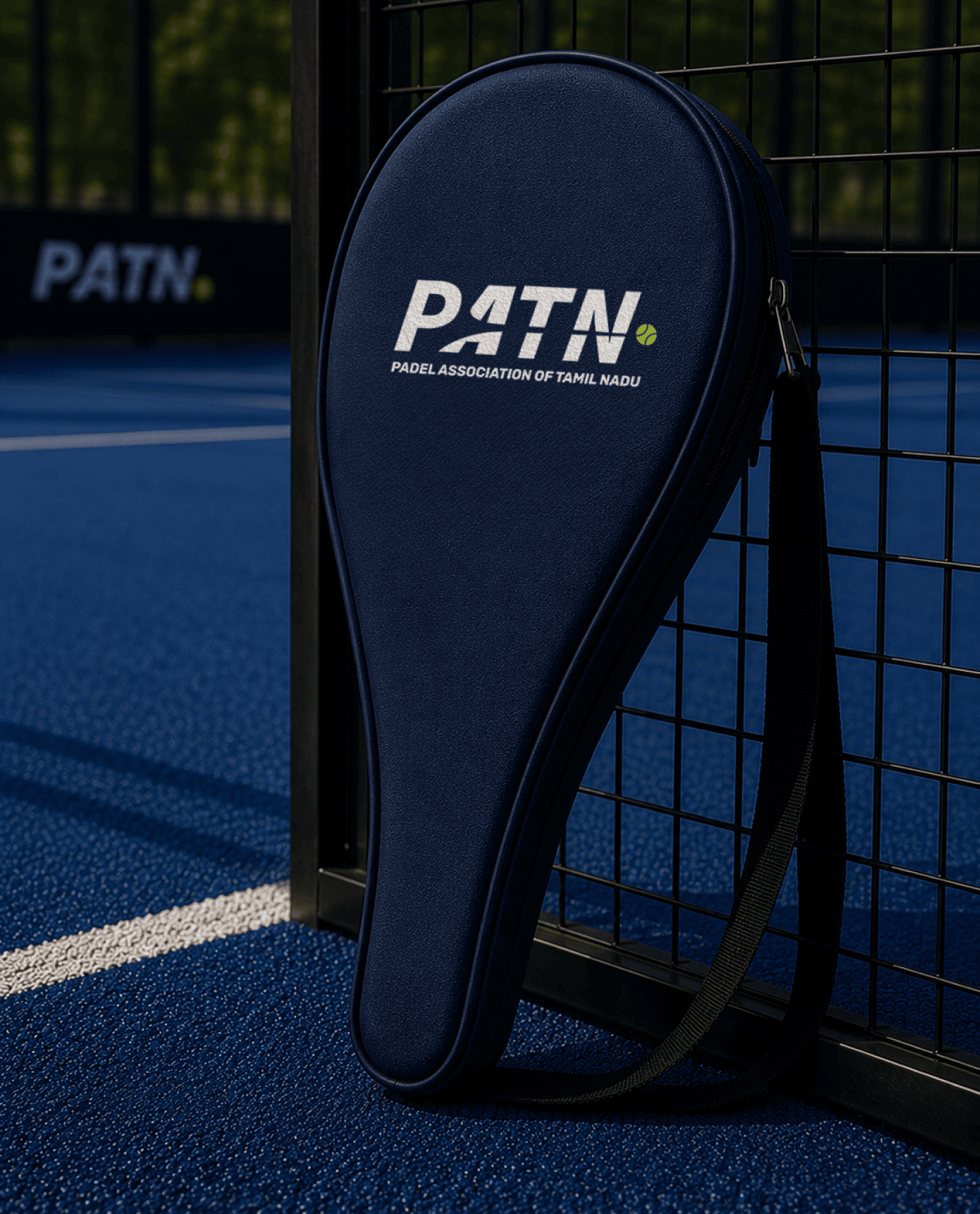
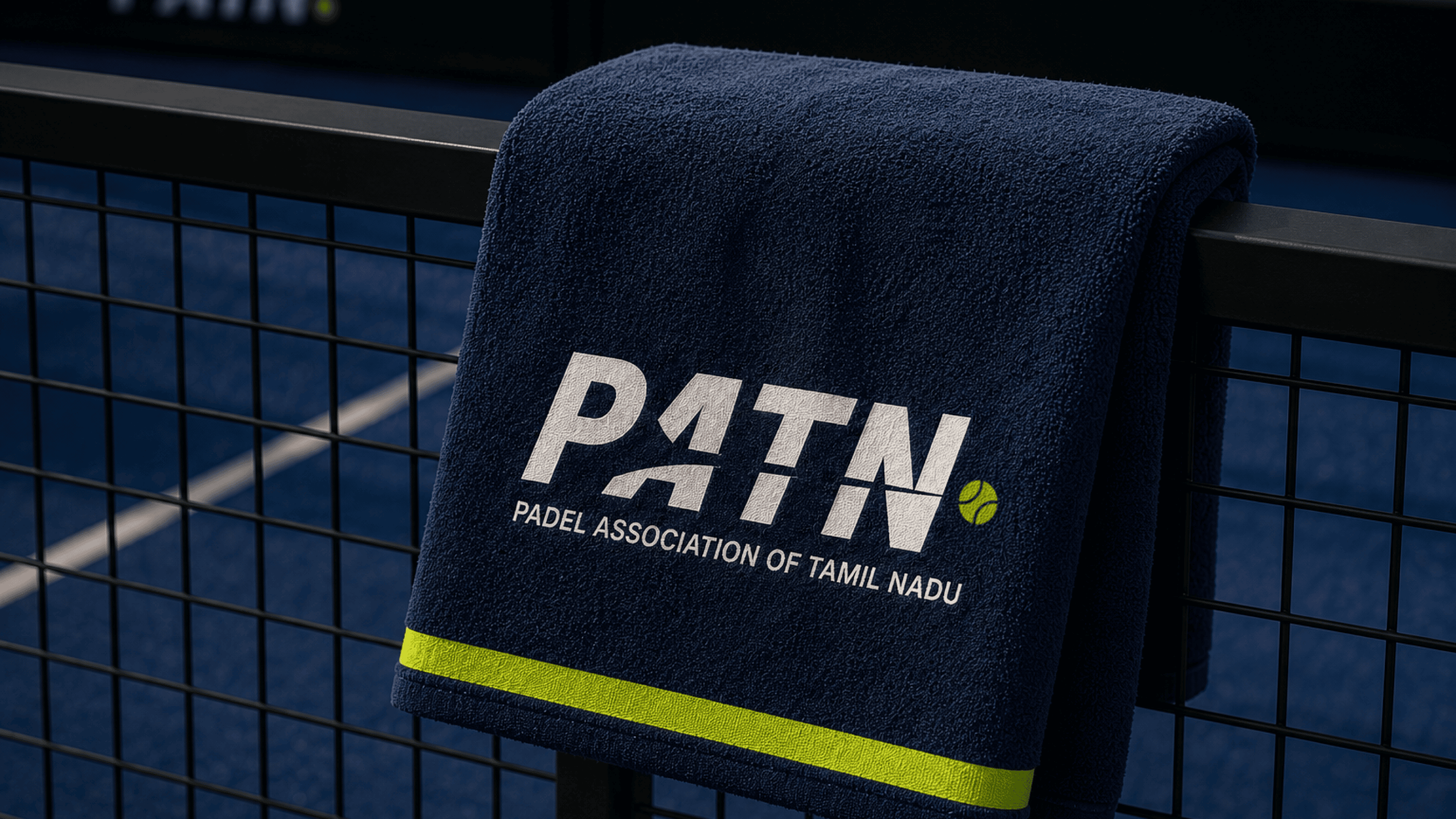
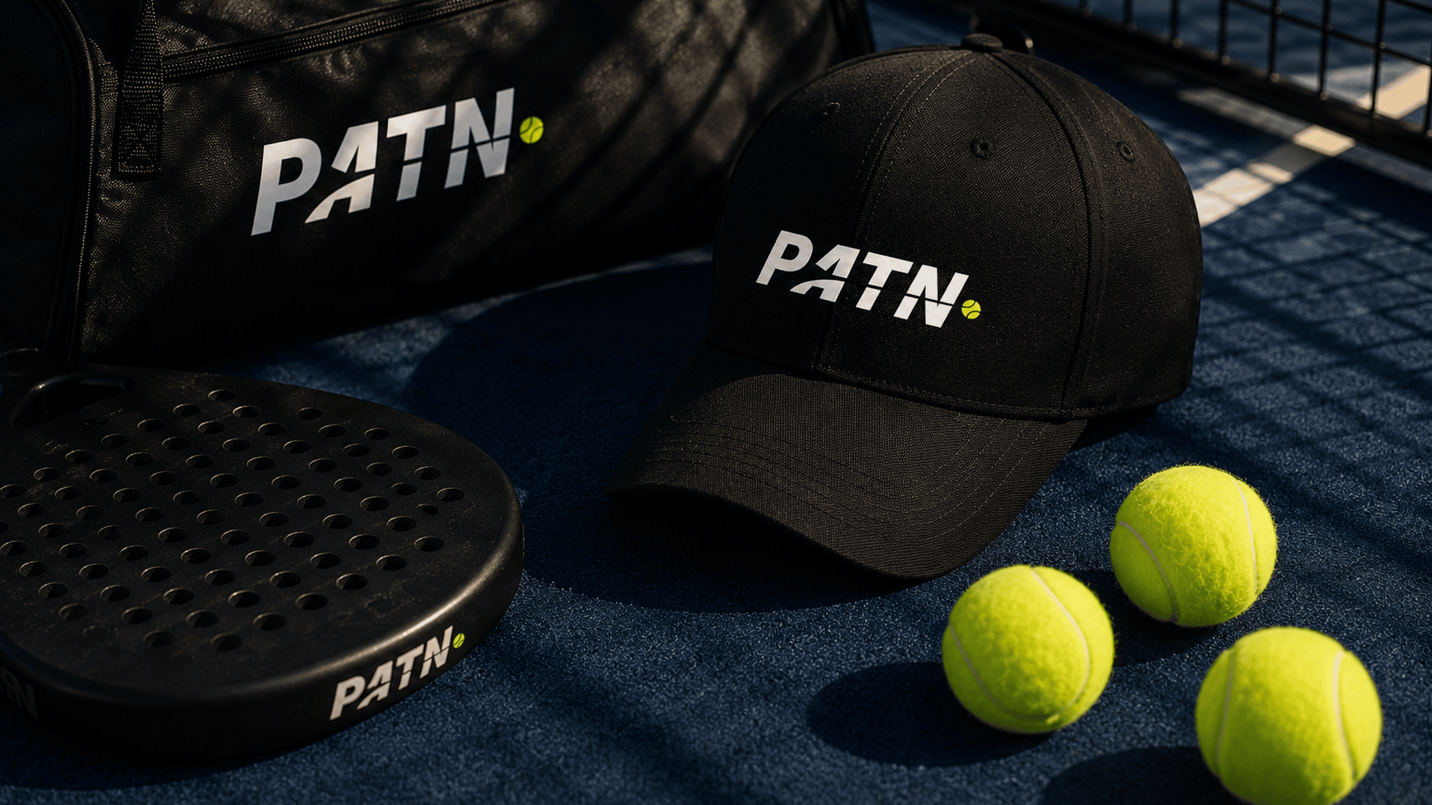
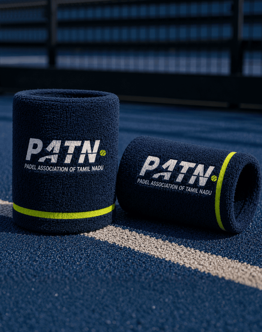
Where the brand lives off the screen.
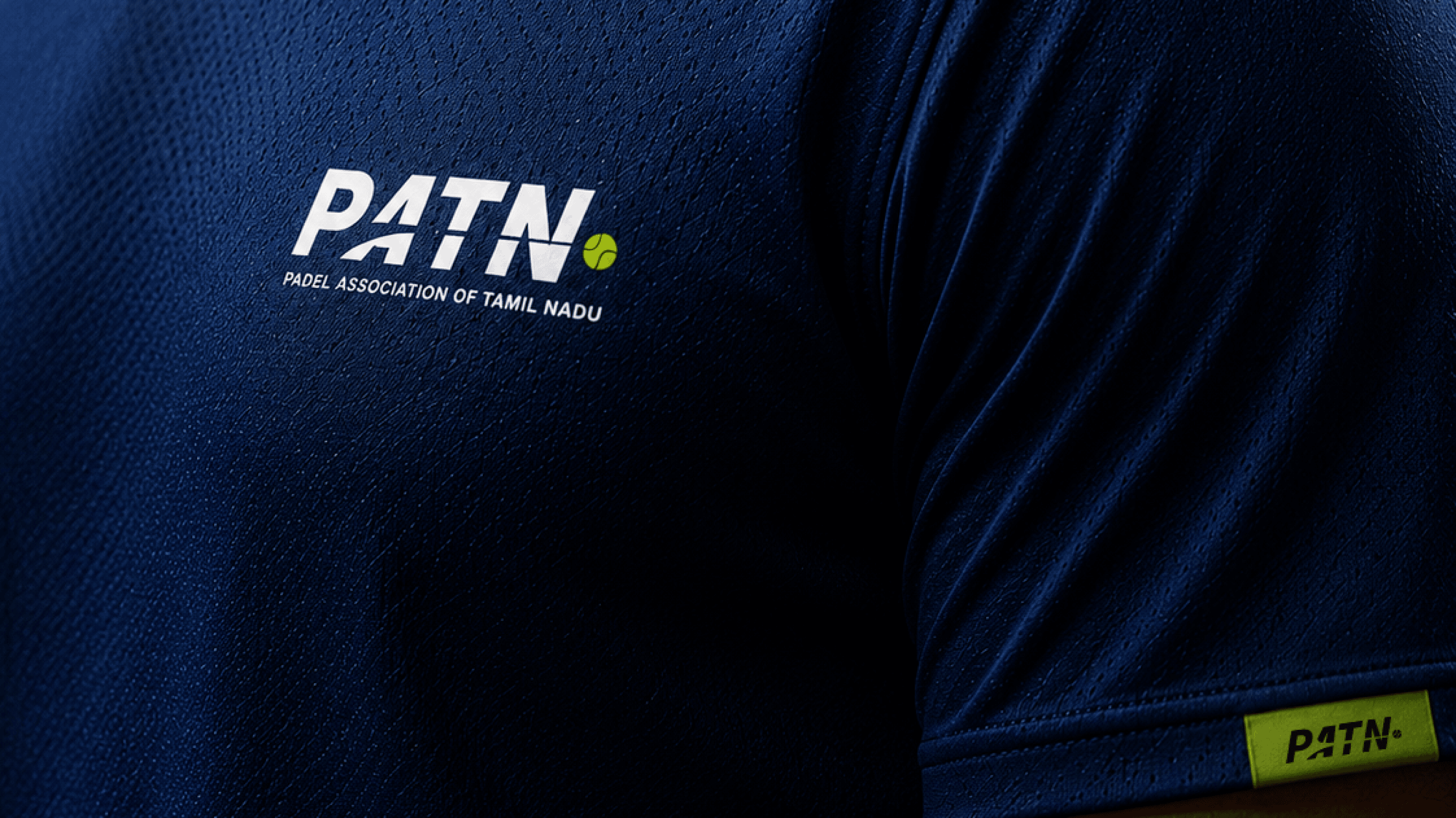
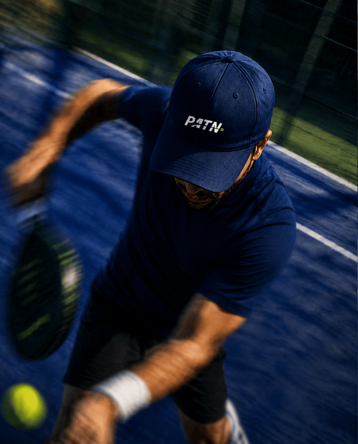
Kits, bags, water bottles, racket covers, caps the PATN identity was built to wear well. The same diagonal energy and athletic confidence that defines the logo carries through to every piece of merchandise and physical touchpoint.


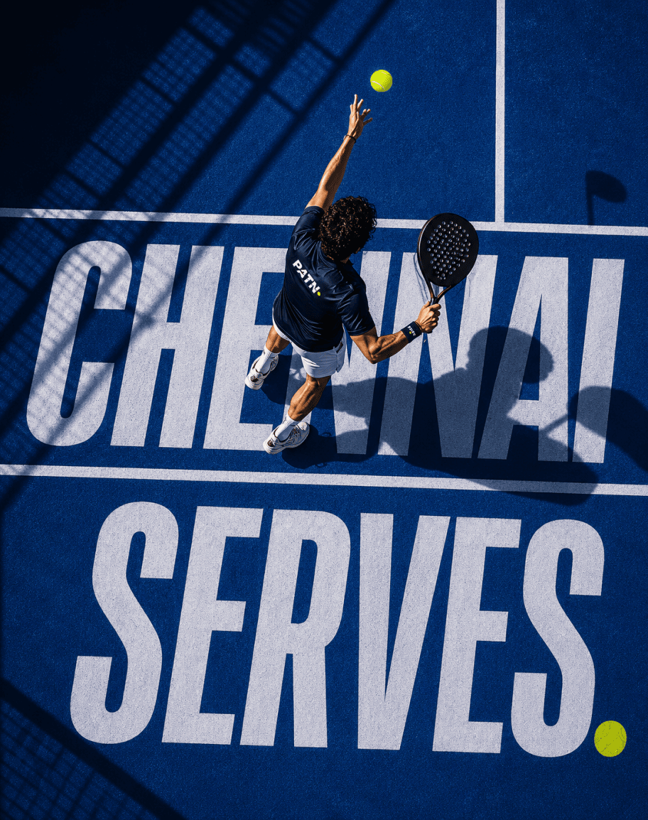
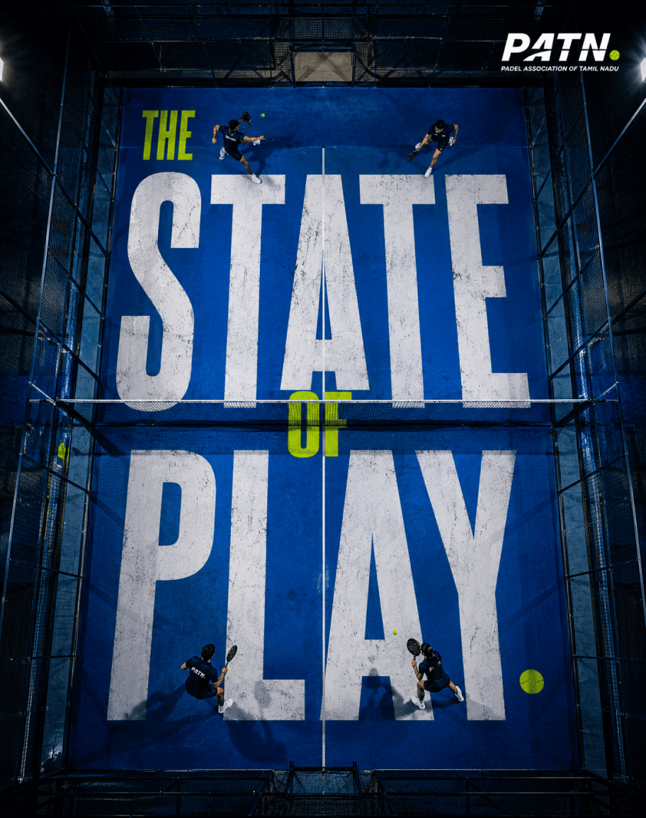
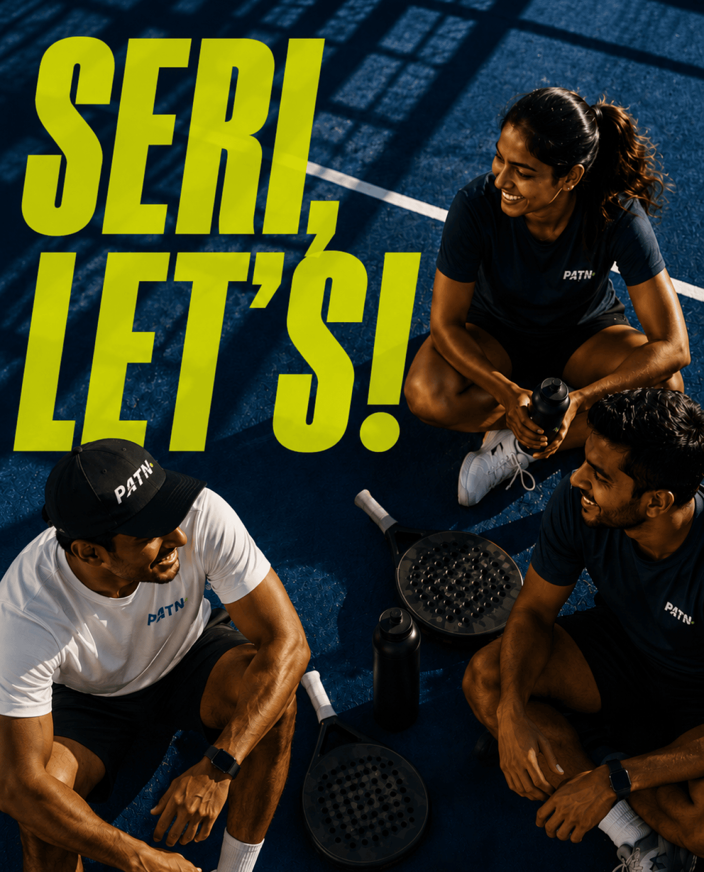
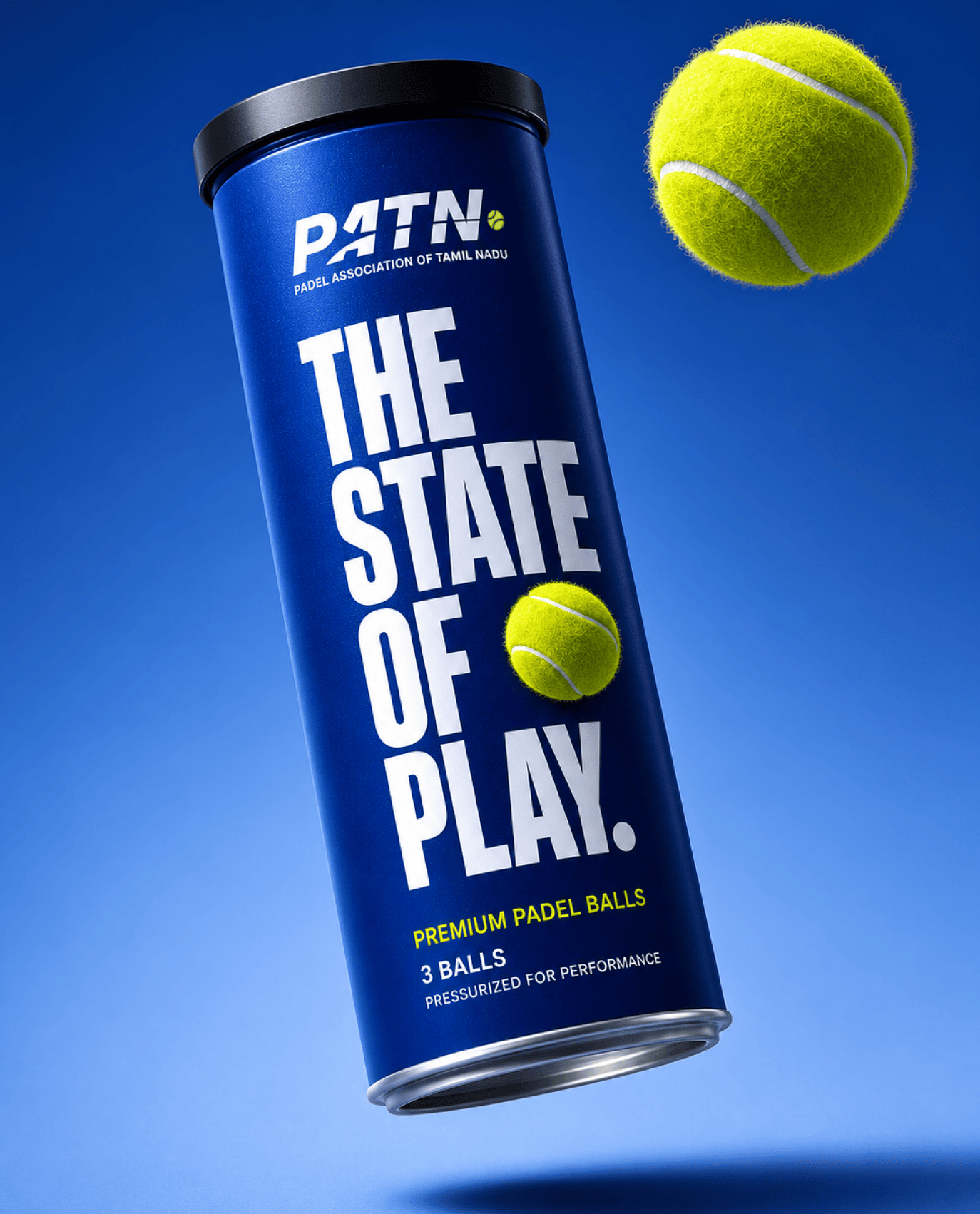
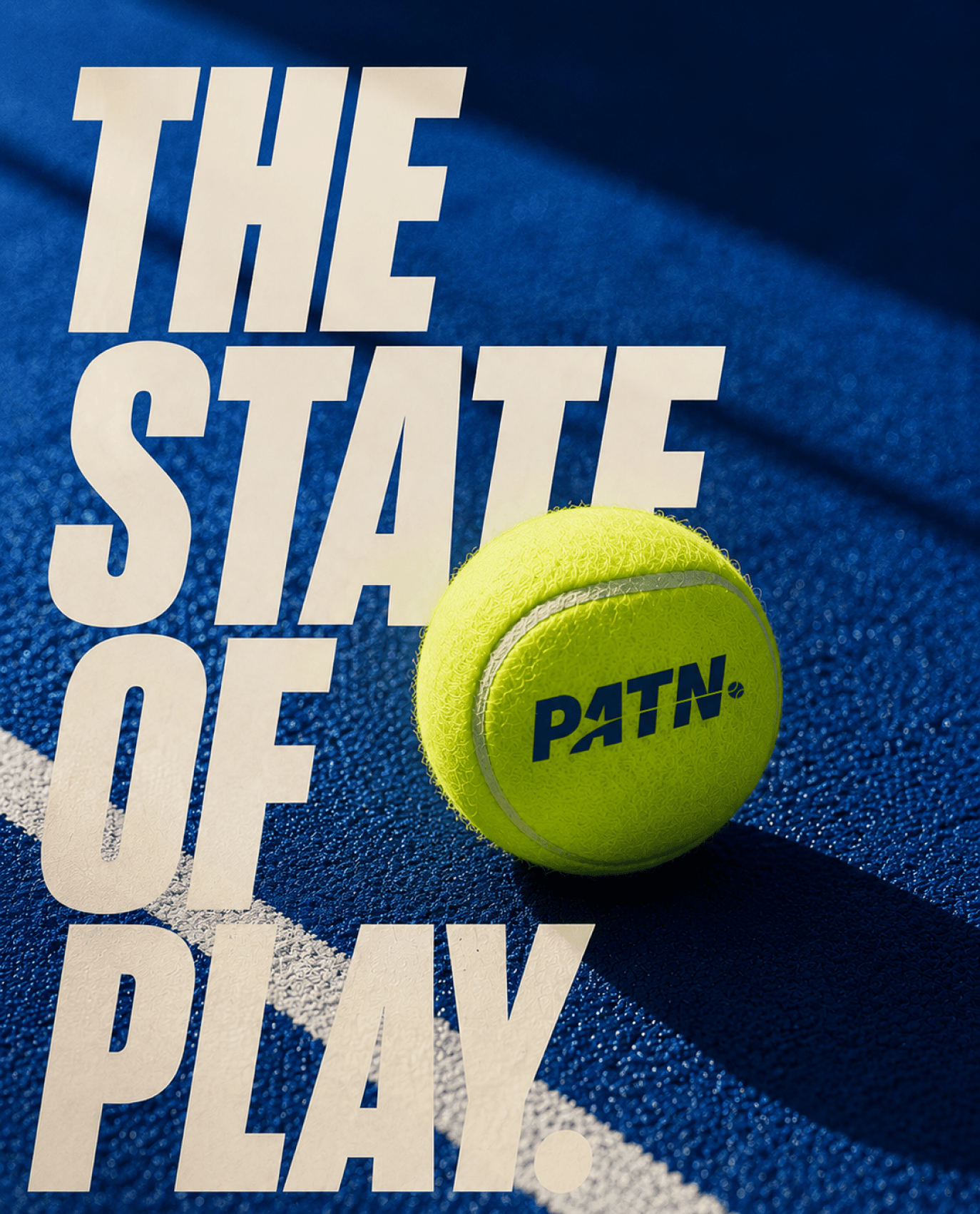
The State of Play
Padel has a way of pulling people in. The pace of the game. The focus of the rally. The energy on court.
State of Play emerged from that feeling. An idea that speaks to the mindset of play, the culture forming around the sport, and the emergence of Tamil Nadu as a state that plays.


From court to culture.
We extended the brand into a full communications system bold typographic posters, court-side campaign imagery, and social content that speaks directly to the Tamil Nadu padel community. Each piece carries the same energy: direct, athletic, unmistakably PATN.