Sanctuary
A brand shaped by stillness. For a residential space built around light, balance, and intention, we created an identity that feels unhurried. It holds space. It lets the architecture speak first.
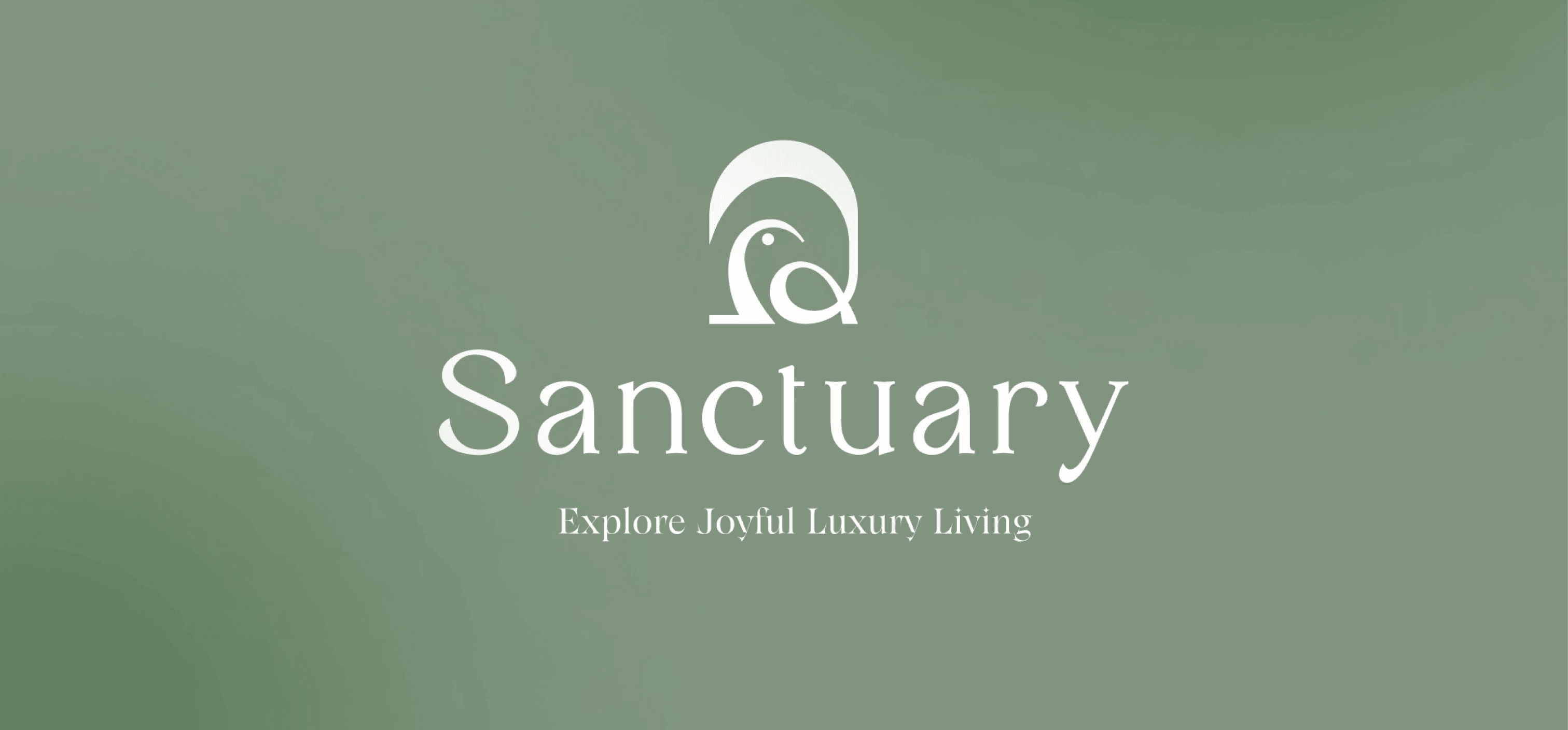
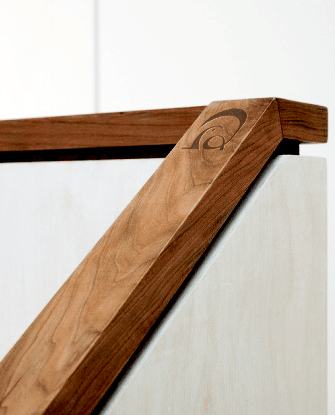
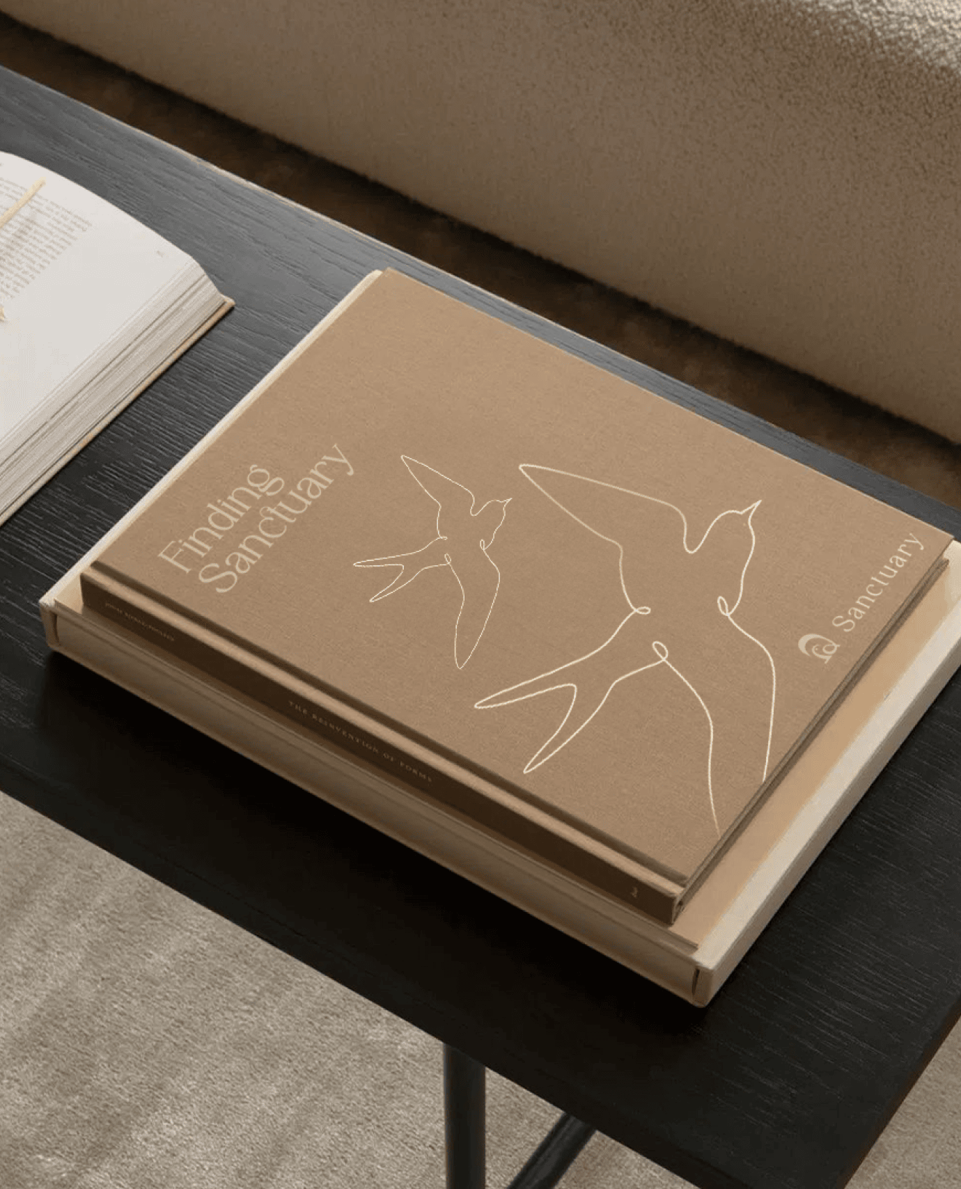
A bird at rest. Perched on a windowsill.
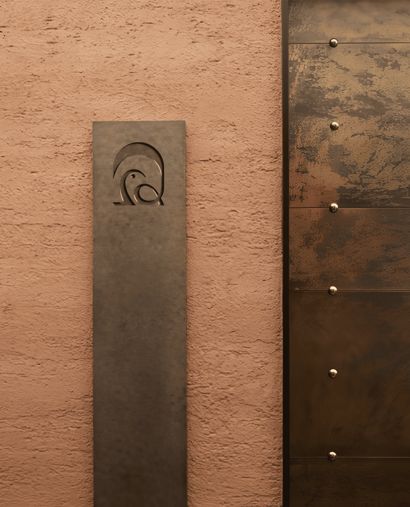
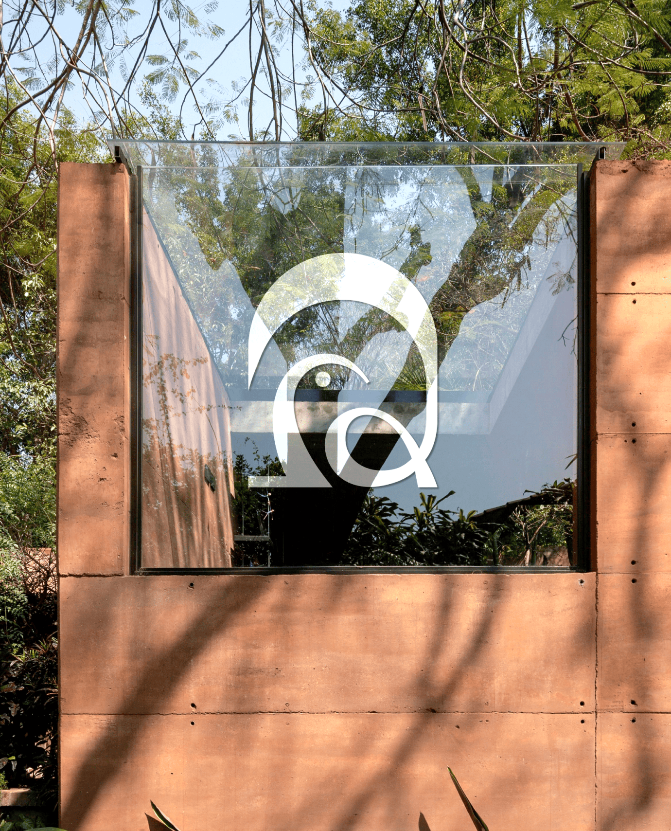
The mnemonic blends structure and softness, the clean geometry of an opening, the gentle curve of a bird finding pause. It signals quiet arrival. A mark made to feel grounded, warm, and unmistakably serene. The rest of the identity steps back. Muted greens. Clean type. Patterns drawn from simplified botanical forms. It aligns with the architecture instead of overwhelming it.
Beyond the Logo
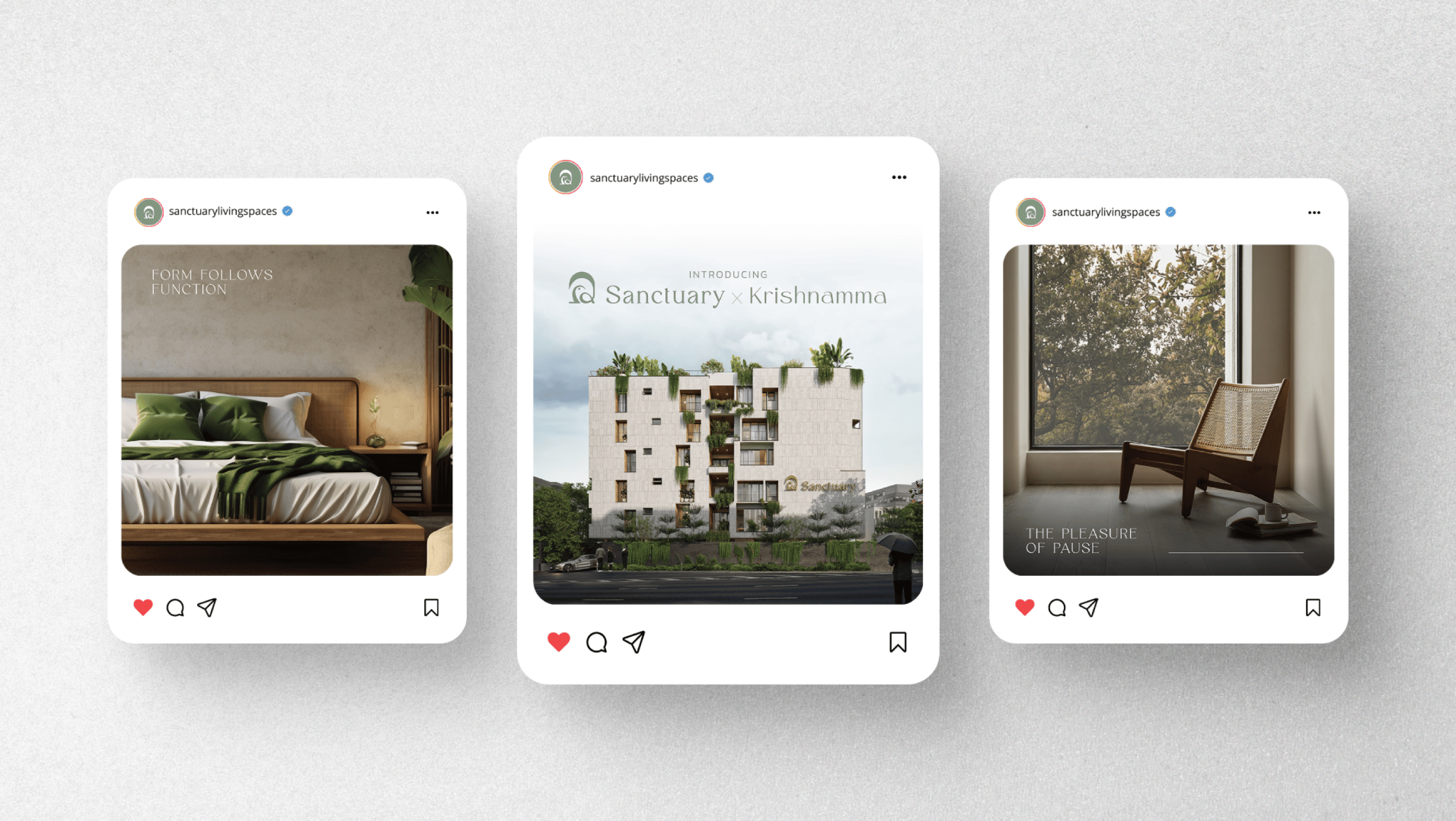
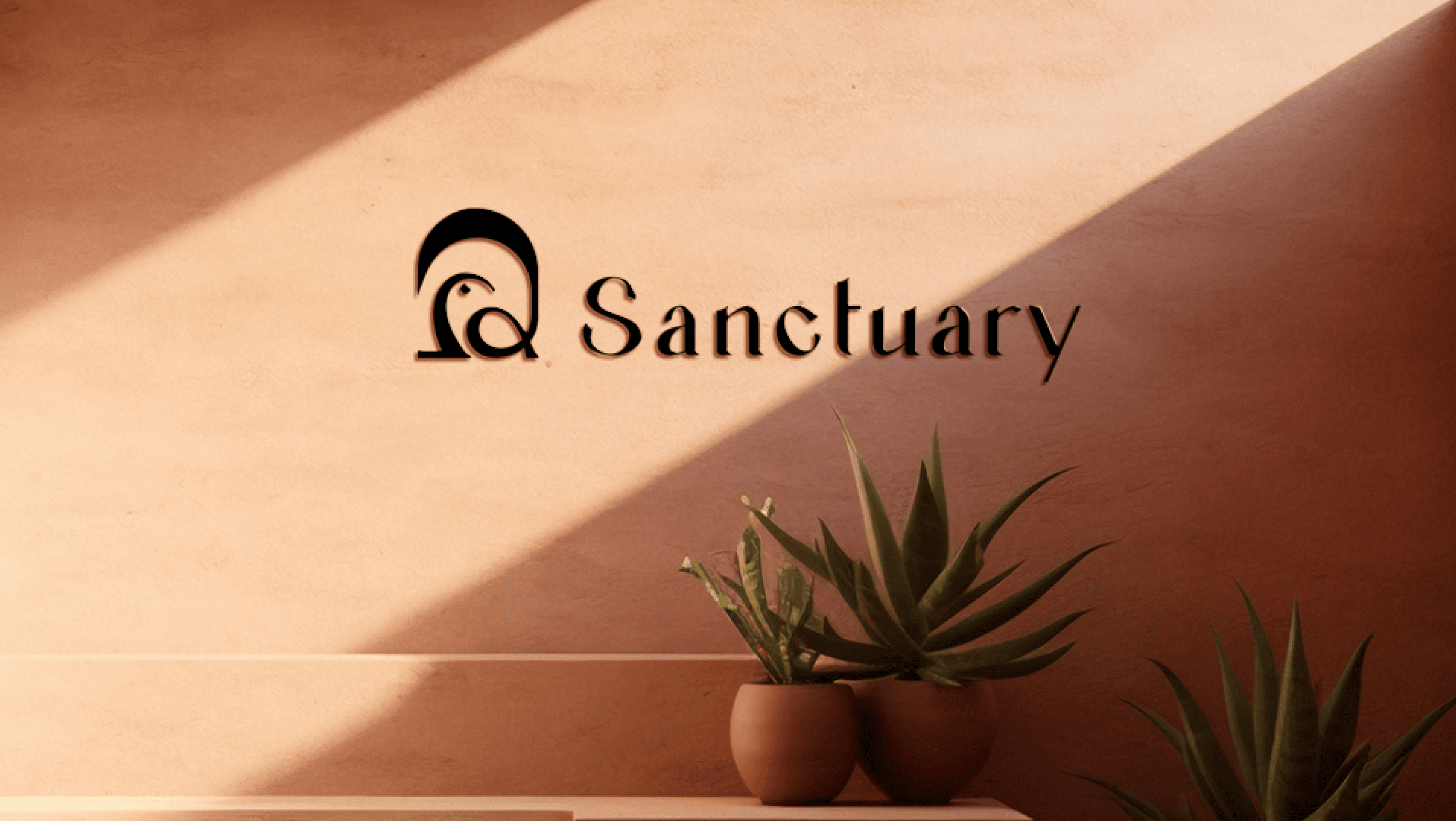
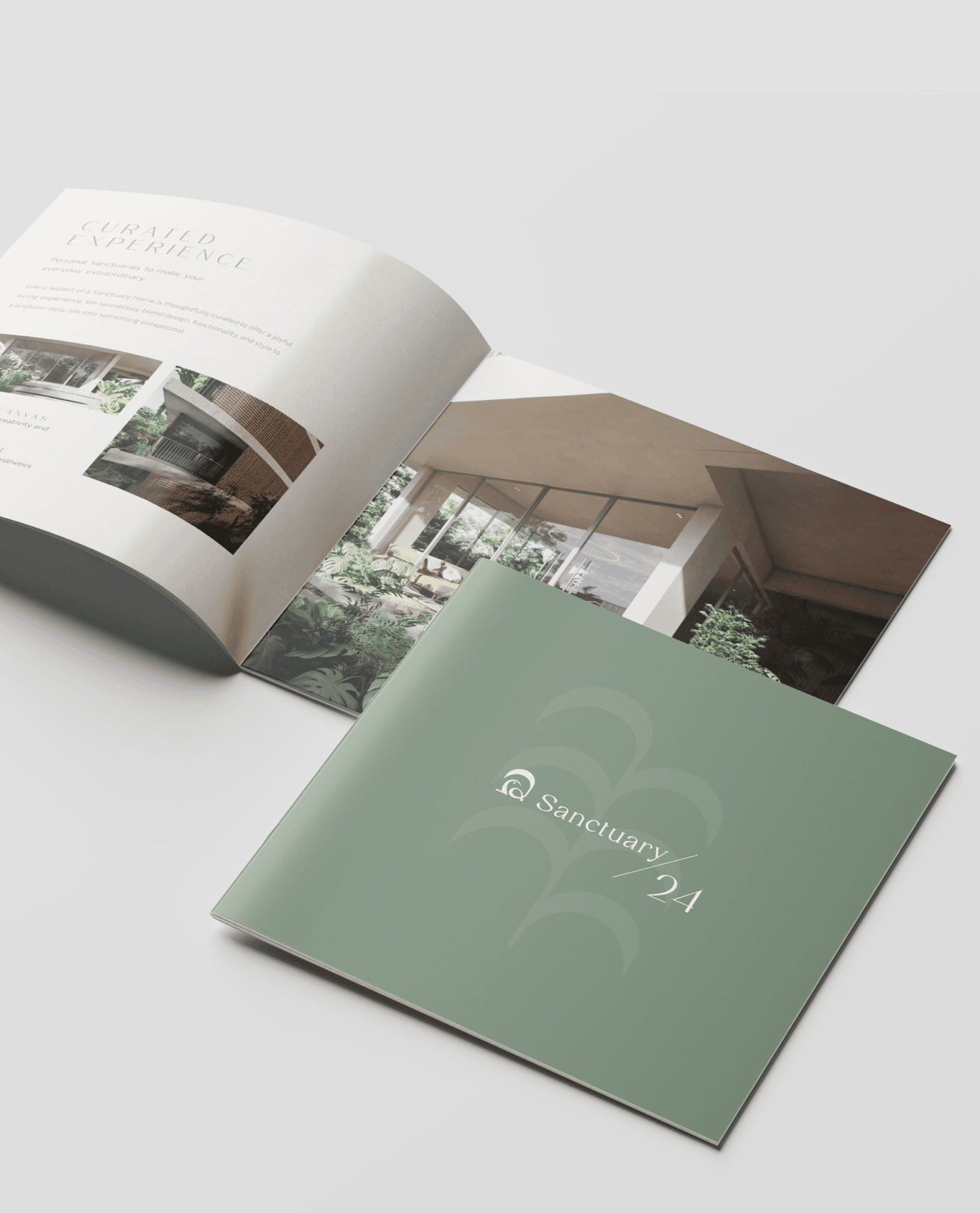
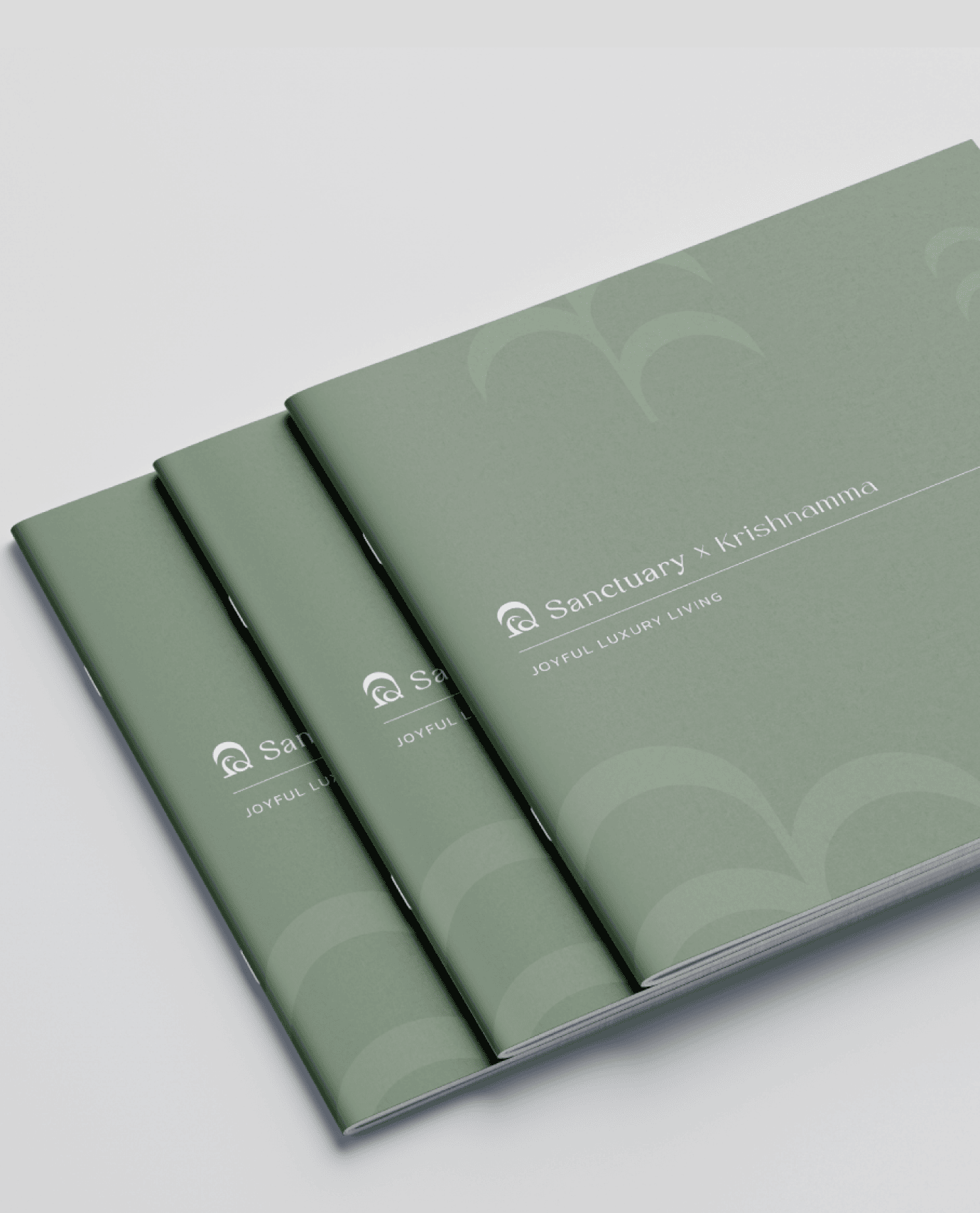
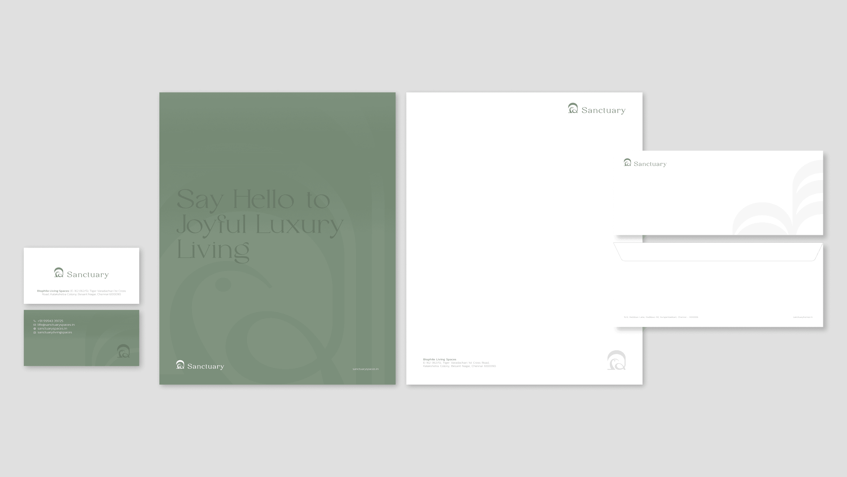
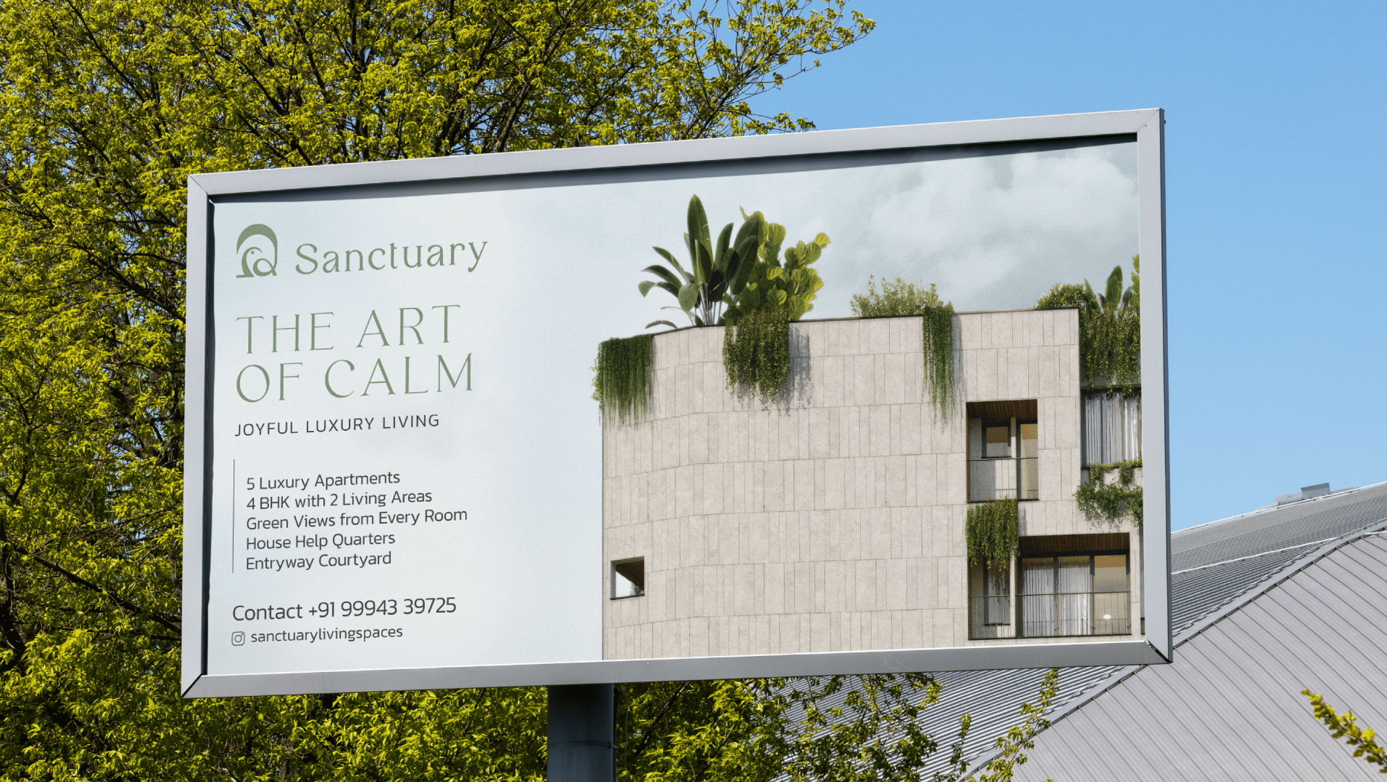
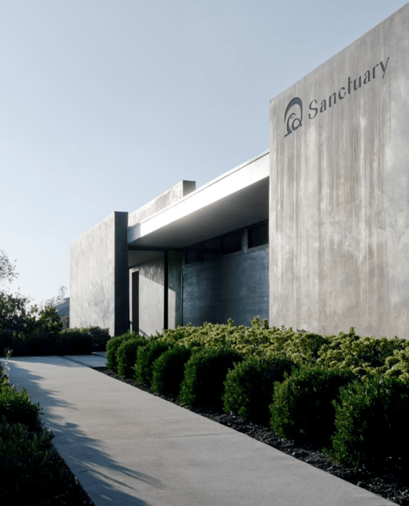
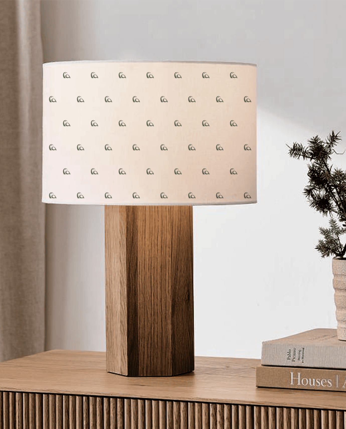
A feeling only becomes a brand when it shows up consistently. From brochures and sales collateral to site branding, signage, and digital touchpoints, every piece was designed to carry the same sense of calm. Each element was created to reinforce the character of Sanctuary. Quiet, thoughtful, and considered. Whether viewed on a brochure cover or a printed touchpoint, the experience remains the same. Understated. Intentional. Familiar.
Shaping the Feeling
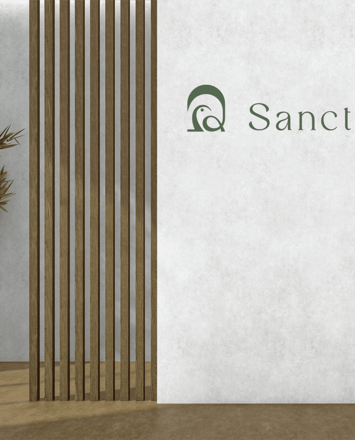
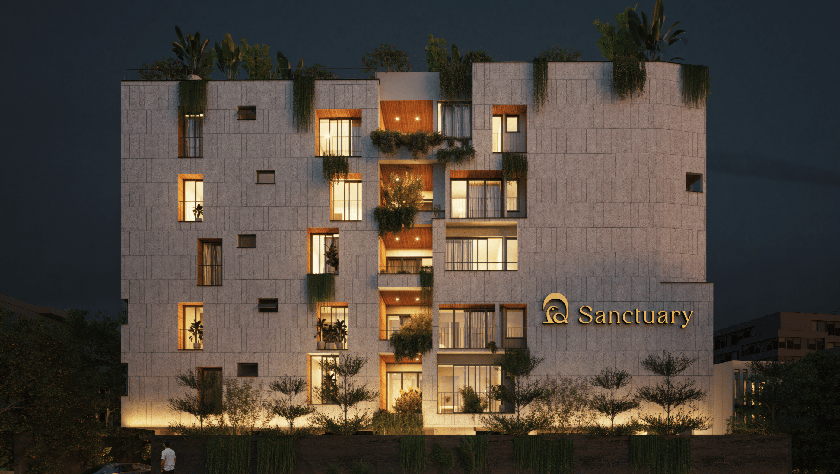
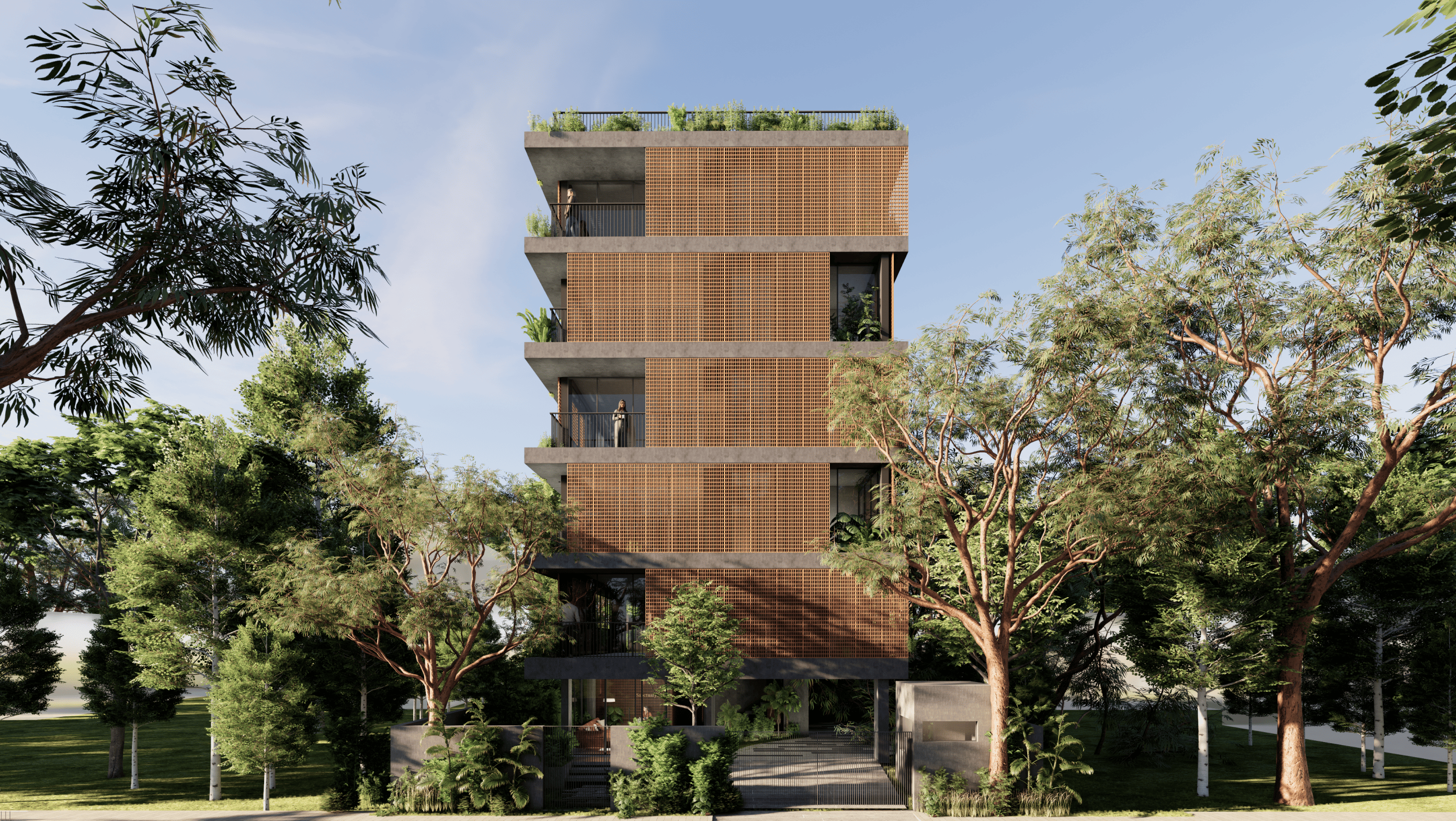
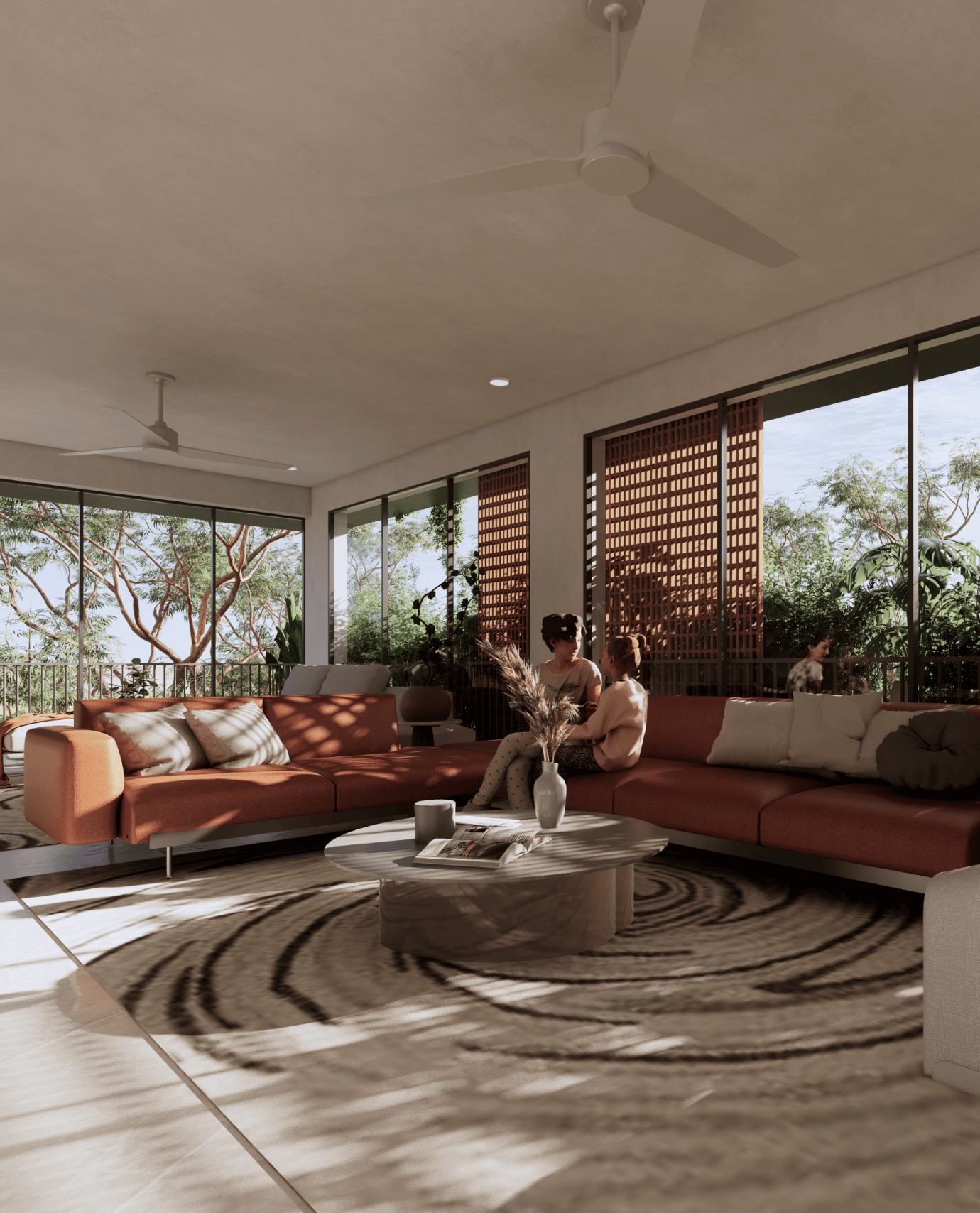
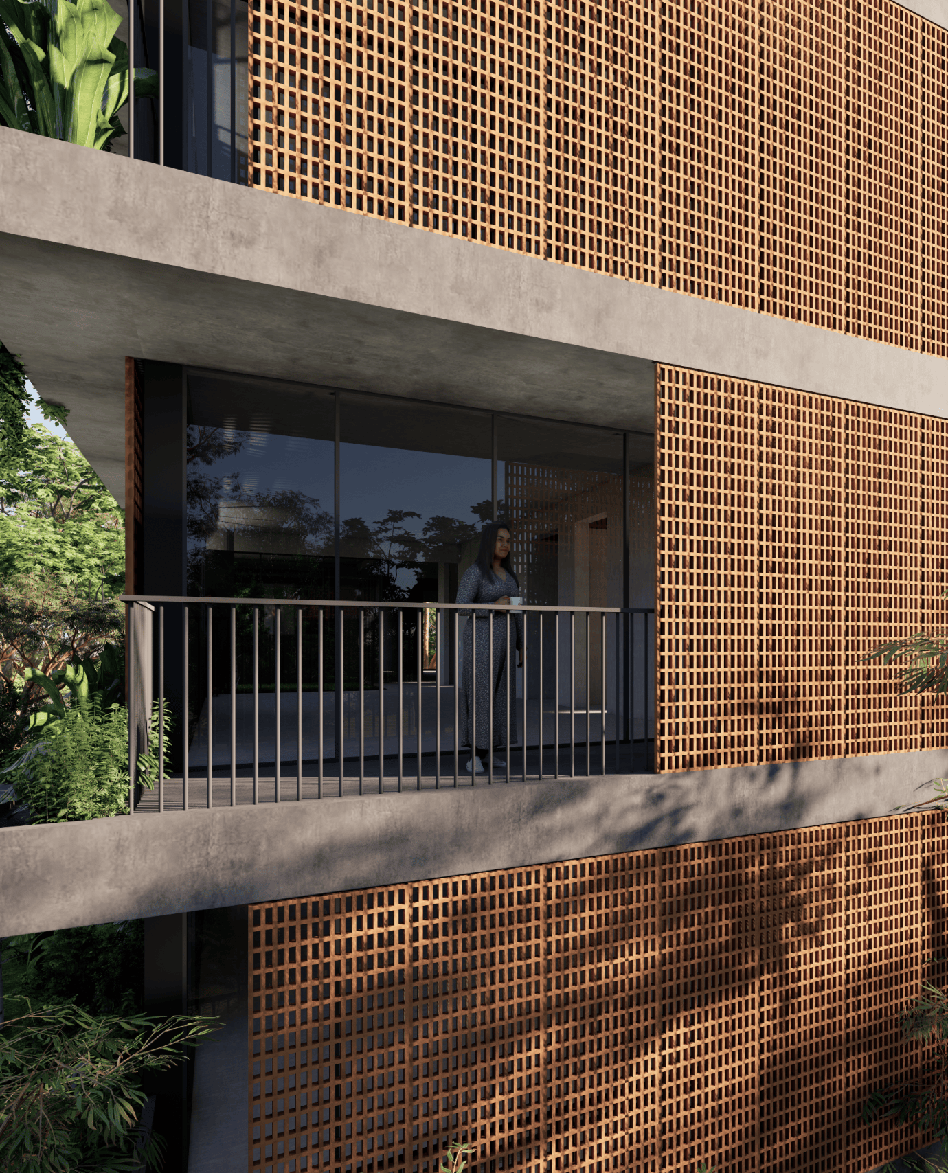
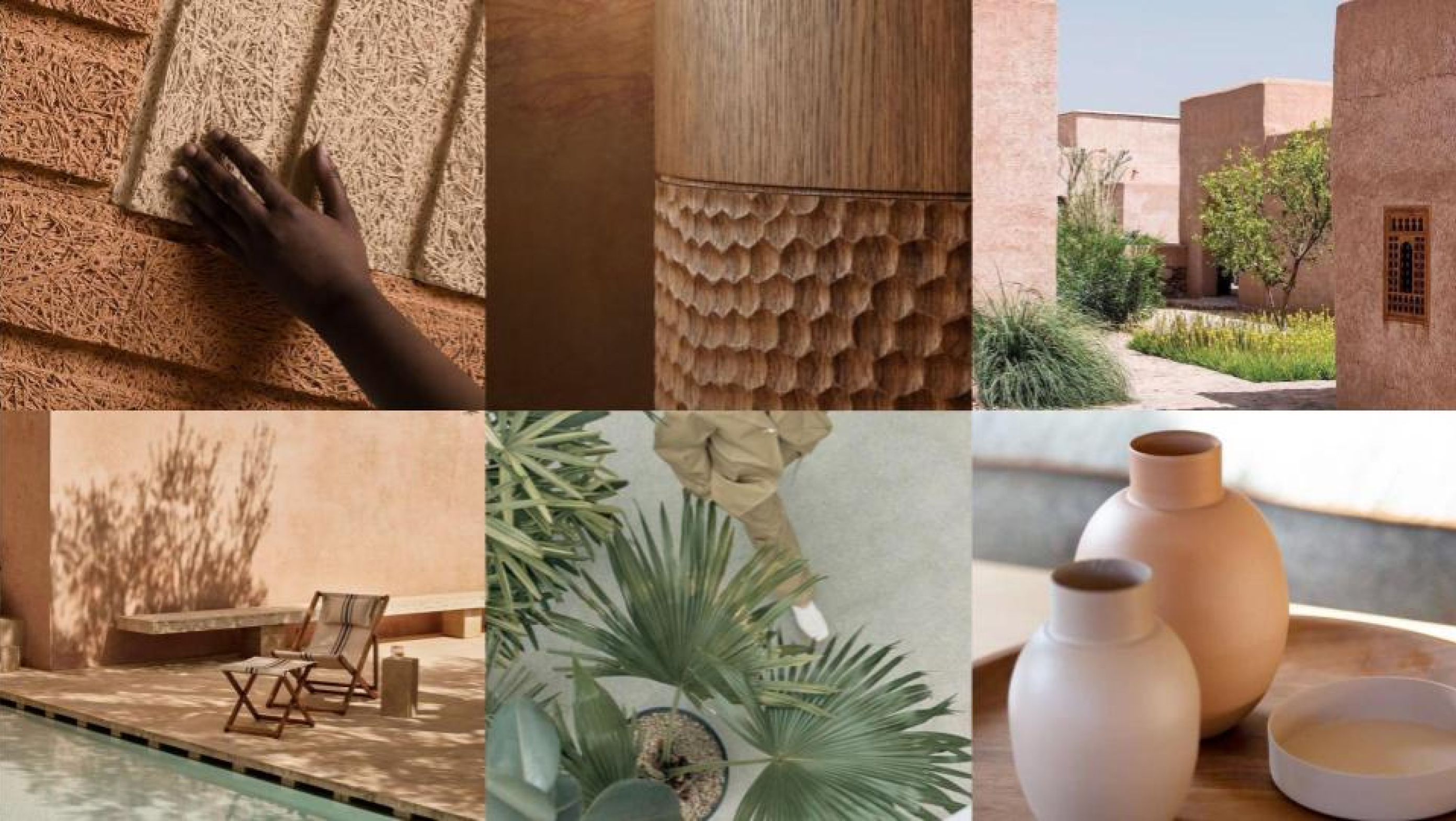
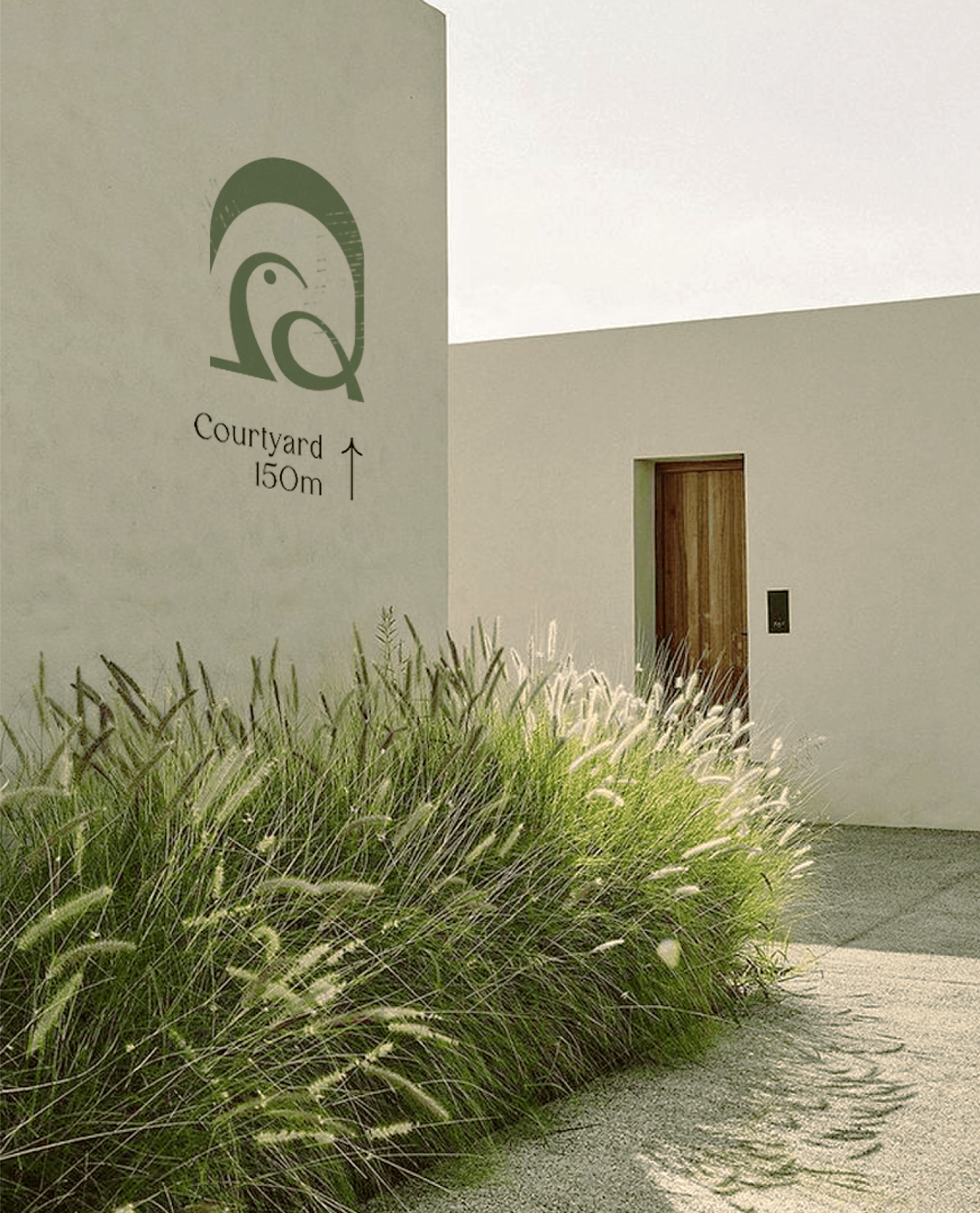
A brand is not separate from the place it represents. Alongside the identity, we explored the visual and material language that could help define the experience of Sanctuary. Warm textures, natural finishes, filtered light, soft landscaping, and a palette drawn from the surrounding environment. The goal was never to create a layer on top of the architecture. It was to create alignment between the brand and the spaces people would eventually call home.
Environmental & Digital Experience
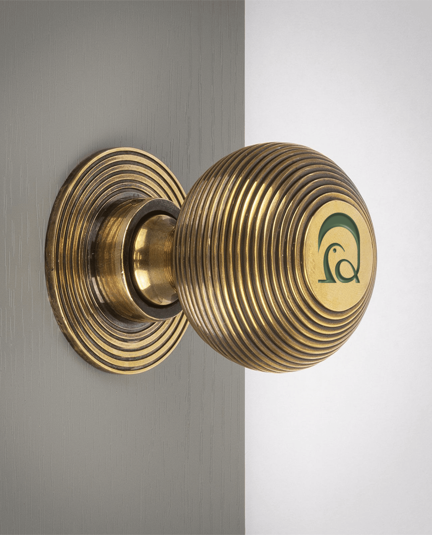
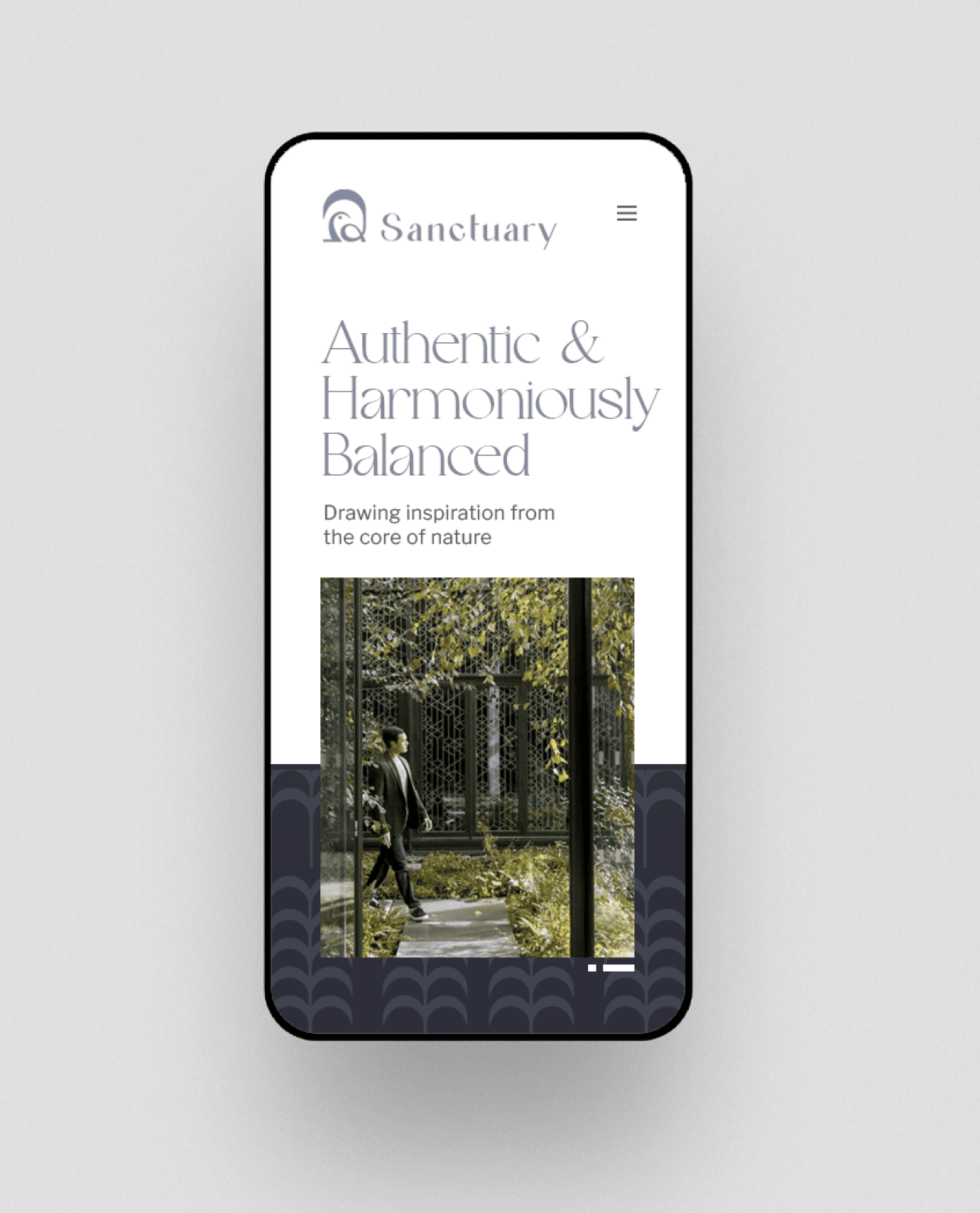
The brand was designed to move seamlessly between physical and digital spaces. From billboard hoardings and site signage to the digital presence and web experience, the identity holds together across every scale and context.
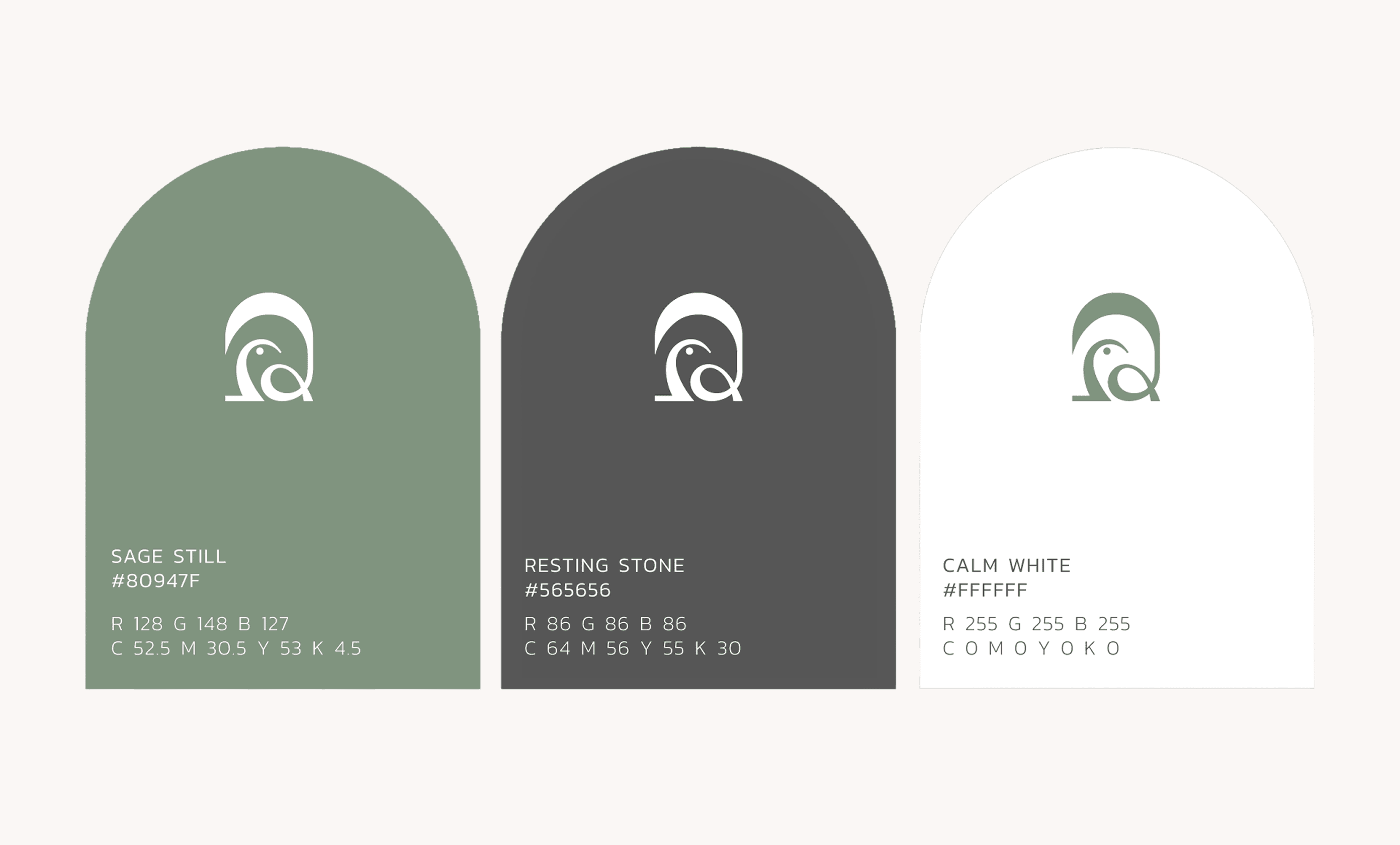
A Palette Built for Pause
The colour system draws from the same idea as the brand itself. Muted greens, warm neutrals, and soft contrasts create a visual language that feels calm and enduring rather than trend-driven. Together, the colours support the architecture, the landscape, and the identity without competing with them.
A Brand That Settles In
Across social media, printed materials, signage, and everyday touchpoints, Sanctuary was designed to feel present without feeling intrusive. The identity works quietly in the background, building recognition through consistency rather than repetition.